A Brand Identity That Cuts the Crap and Makes Its Own Luck
If my studio wasn’t called Seeside Studio, I can confidently say it would be called Rabbit Foot Studios, and my logo would be a bad-ass rabbit, wielding a meat cleaver and cutting its own foot off to make its own luck.
I think that has to be one of the coolest visual stories I’ve ever seen in my twelve years as a graphic designer, and I got the opportunity to tell it.
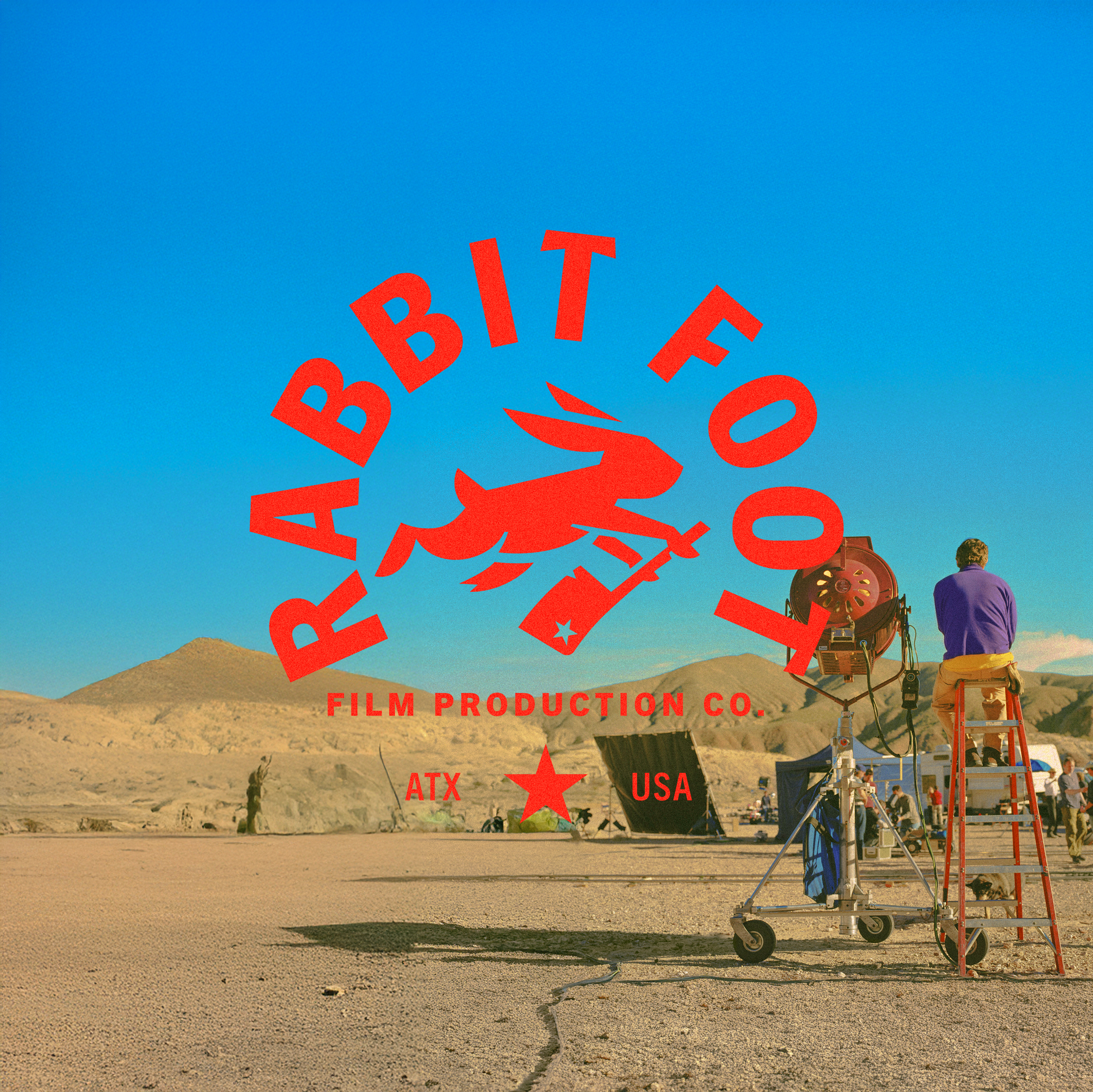
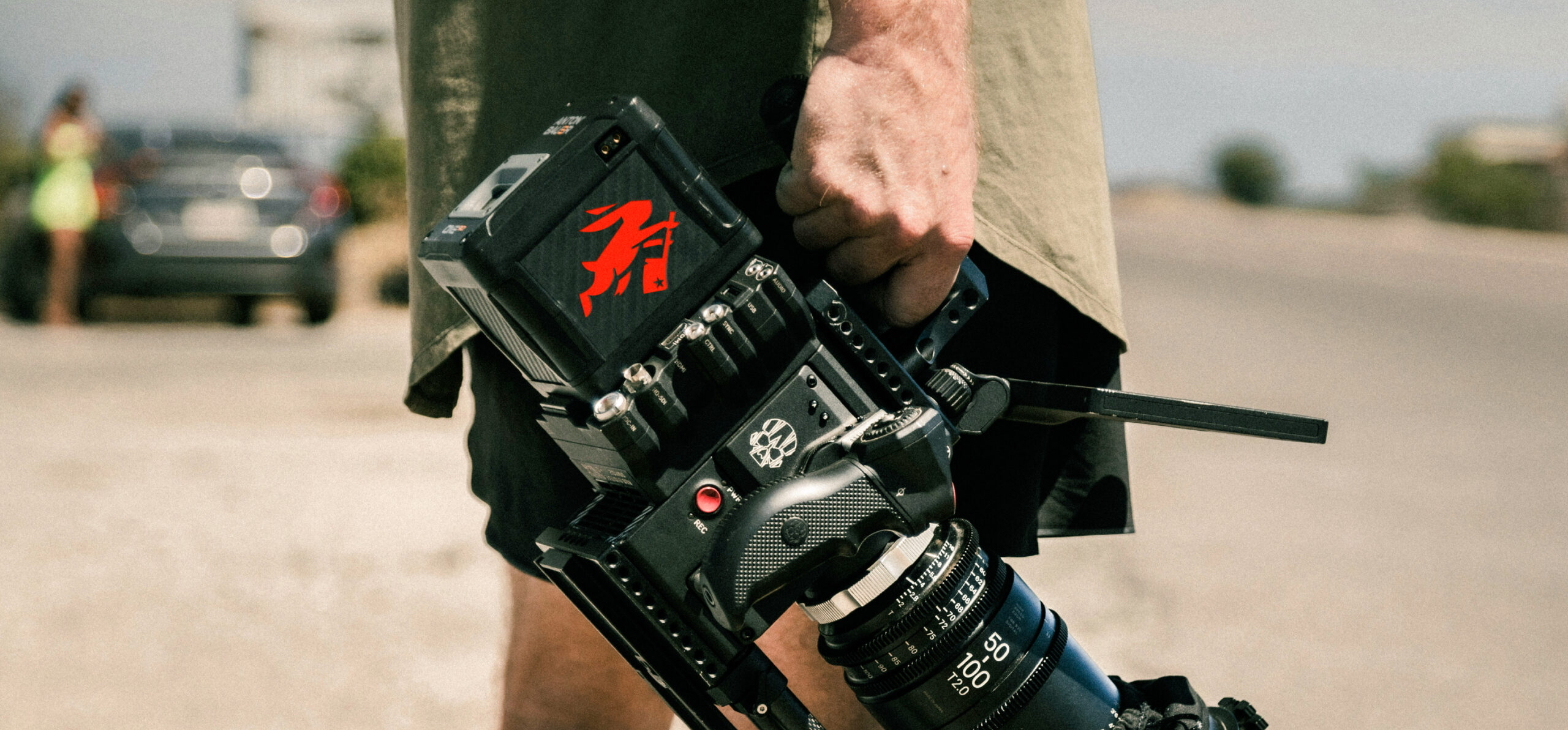
Earlier this year, I had the privilege of working with Will, Sam, and Clayton on the rebrand for their film production company, Rabbit Foot. The guys had been creating powerful, story-first films and TV work for just over a decade.
Their logo and visual identity, while built around one of the most badass brand stories I’ve ever come across, just didn’t hold up anymore. It wasn’t getting them into the rooms they wanted to be in, or giving them a seat at the table with the people they wanted to talk to.
So my job as a designer was simple on paper, but huge in meaning: help them tell that same story of tenacity, relentlessness, and filmmaking brilliance, but tell it in a way that spoke to a new audience.
DON'T FIX SOMETHING THAT'S NOT BROKEN
The problem the guys described to me was simple – their old logo just didn’t match who they were anymore.
However, the story behind the logo was still f*cking awesome. A rabbit willing to cut its own foot off to make its own luck. That’s one of the best brand stories I’ve ever heard. The issue had nothing to do with the story. That didn’t need fixing. It was the execution — that’s where things fell short.
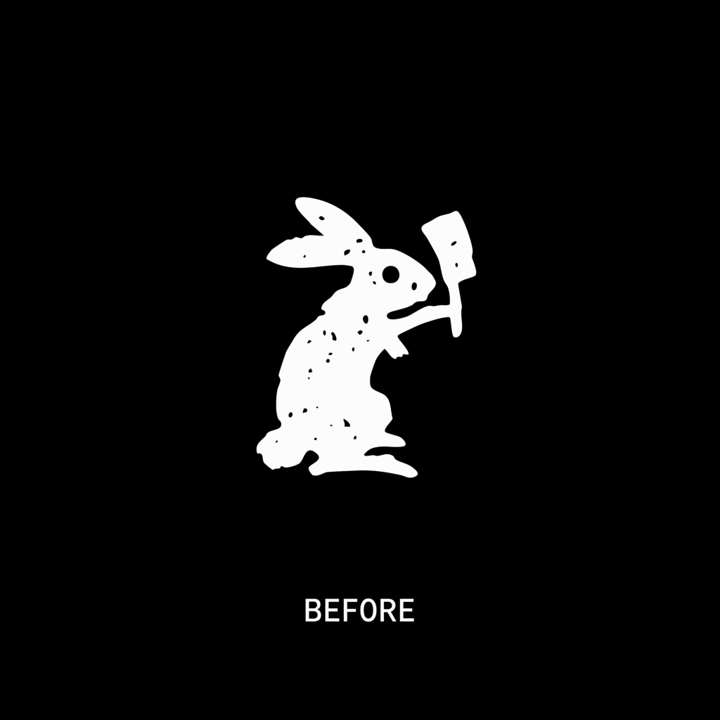
The rabbit itself looked terrified. Big peeping eyes, all battered and bruised, rough and distressed. It felt indie. It felt like a small film studio just starting out, trying to figure things out. Which, to be fair, was exactly what they were back then. So it made total sense at the time.
But that’s not who they are anymore. Things have changed. They’ve grown. The work’s grown. The team’s grown. The confidence has grown. They’re no longer that small indie outfit, they’re a serious film production company wanting to sit at tables with the likes of Disney, Netflix, and Peacock.
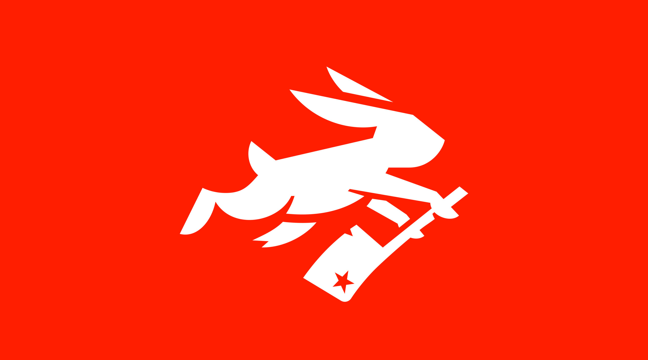
And their old mark just didn’t carry that same confidence. It didn’t feel bold, fast, or agile. These were the words they were using to describe who they are now in our brand discovery call. So the challenge was figuring out how to evolve that same incredible story – that rabbit who’s willing to cut a piece of itself off to move forward – into something that actually looked like it was moving forward.
The goal wasn’t to start from scratch. It was to evolve what was already there and to make the rabbit look stronger, smarter, more mature. To take what once looked like a young, frightened rabbit and turn it into something that’s been through the wars but is still charging ahead.
One thing they were clear about from the start: the story had to stay. We couldn’t lose the idea of the rabbit cutting its foot off to make its own luck. That’s the whole soul of the brand. But we did need to lose the gory side of it. The version that made people squeamish. This story I was hearing was about sacrifice, not horror.
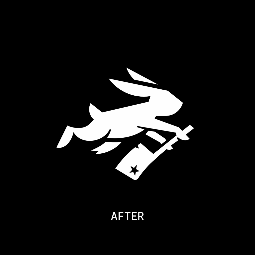
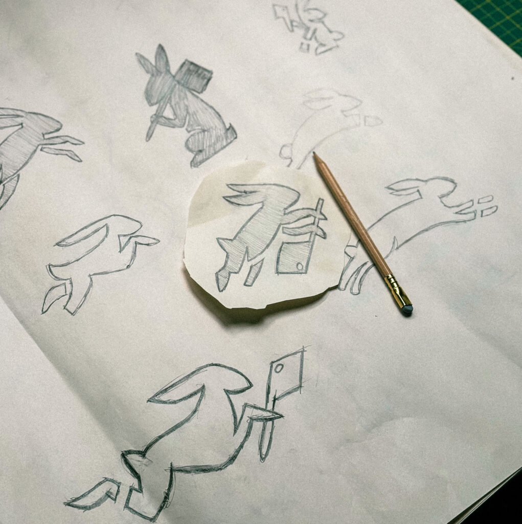
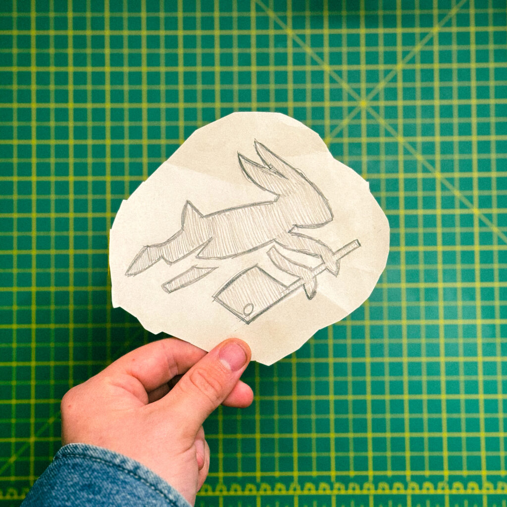
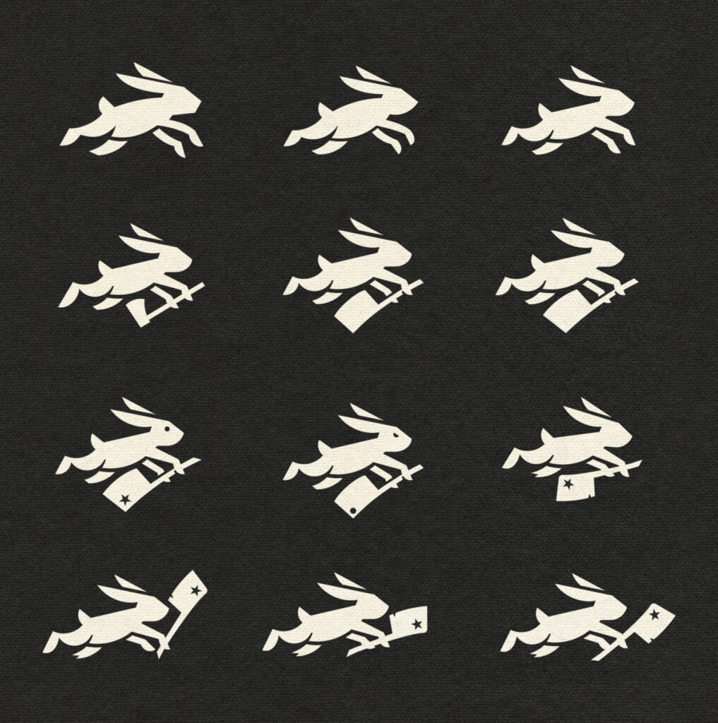
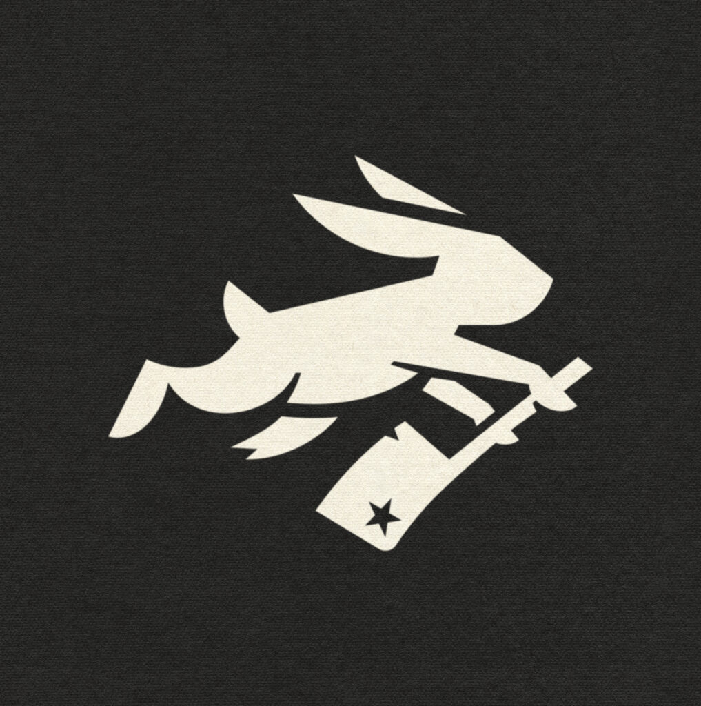
That’s where the design process really began. I started exploring how to simplify the rabbit, stripping away the noise but keeping the energy. I rebuilt it using cleaner, more geometric lines, leaning into negative space to add depth and dimension. I wanted to give the mark a real sense of movement, like this thing’s mid-leap, pushing forward, refusing to stop.
It sounds simple on paper, but it was a nightmare to execute. Getting the proportions right, keeping it readable, making sure it worked small, that’s where all the hours went. But every tweak, every refinement was worth it. Because this time, the rabbit didn’t just sit there injured anymore; it was leaping straight into the future.
