
DESIGNING THE IDENTITY FOR AN INDIAN BEER BRAND READY TO DISRUPT THE MARKET
I had the privilege of working with two brilliant British-Indian-African siblings, Nikita and Sahil, who were on a mission to shake up the beer shelves. Their goal was simple but bold: create an Indian-inspired beer brand that could stand proudly in restaurants, bars, and fridges across the UK, and replace the tired, predictable options found in most English-Indian curry houses.
Now, to do that, we had to throw out the rulebook completely. No clichés. No sticking to what’s safe. This project wasn’t about following a tradition or a trend, it was about respecting heritage while rewriting how it’s presented. That’s where the magic was.
I was lucky enough to be given full creative control, and that kind of trust doesn’t happen often. Nikita and Sahil had the vision, and I was brought in to bring it to life, to give it roots, rhythm, and something that felt deeply meaningful while still being fresh, playful and full of warmth.
Dosti was never just about launching a beer. It was about challenging what’s been accepted for generations, and asking: why can’t it be done differently? Why can’t it be better? That’s the kind of project I’ll always show up for.


The most meaningful mark I’ve ever designed
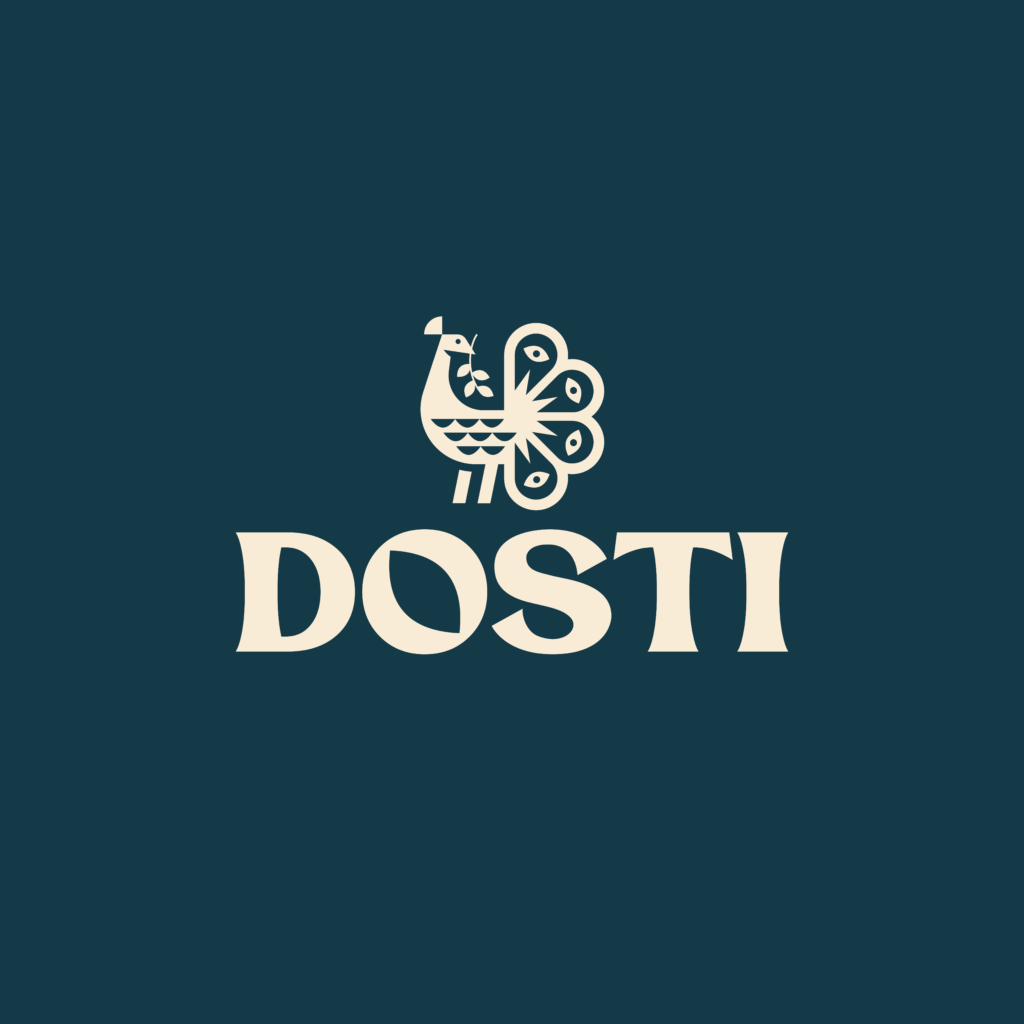
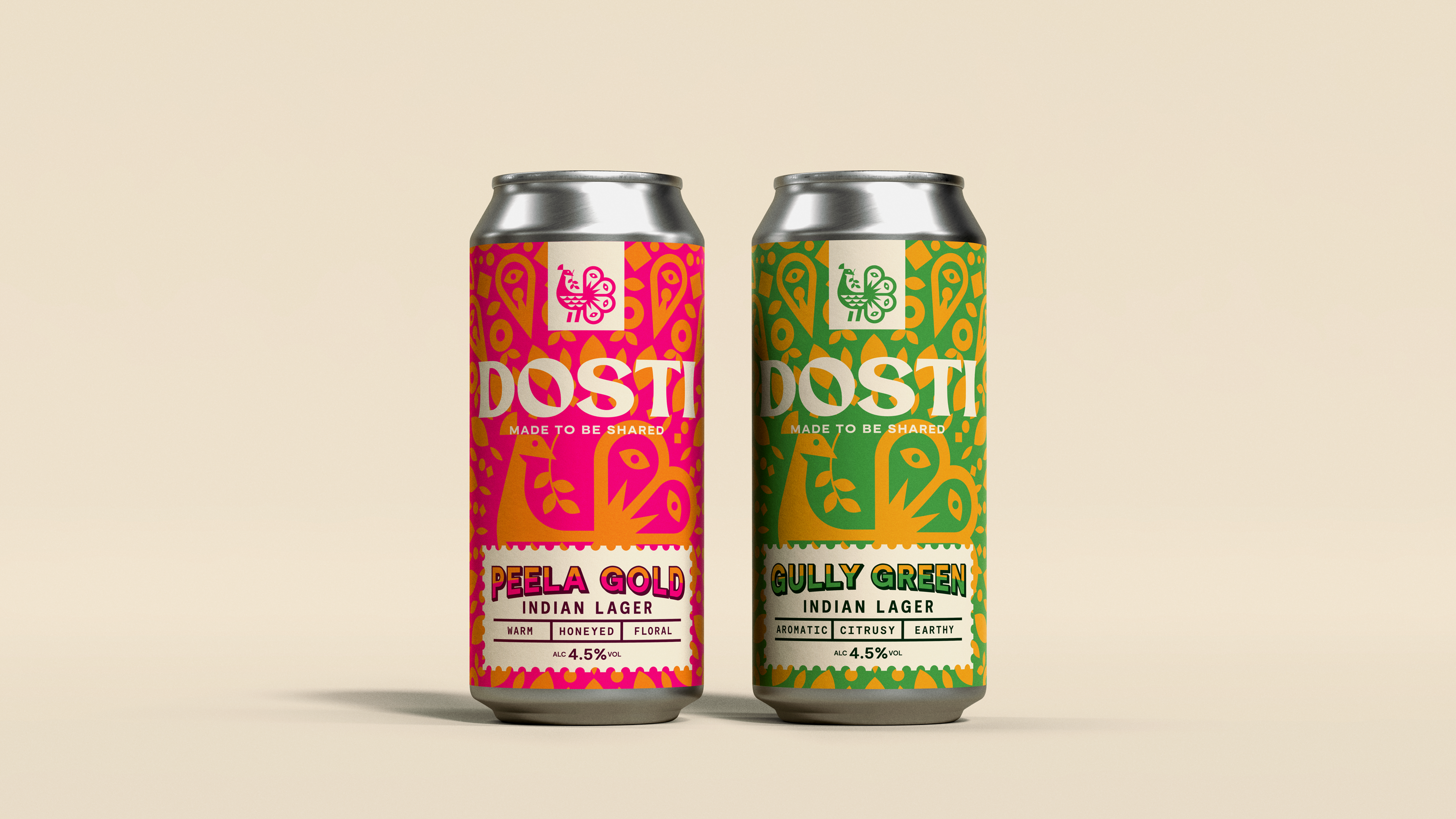
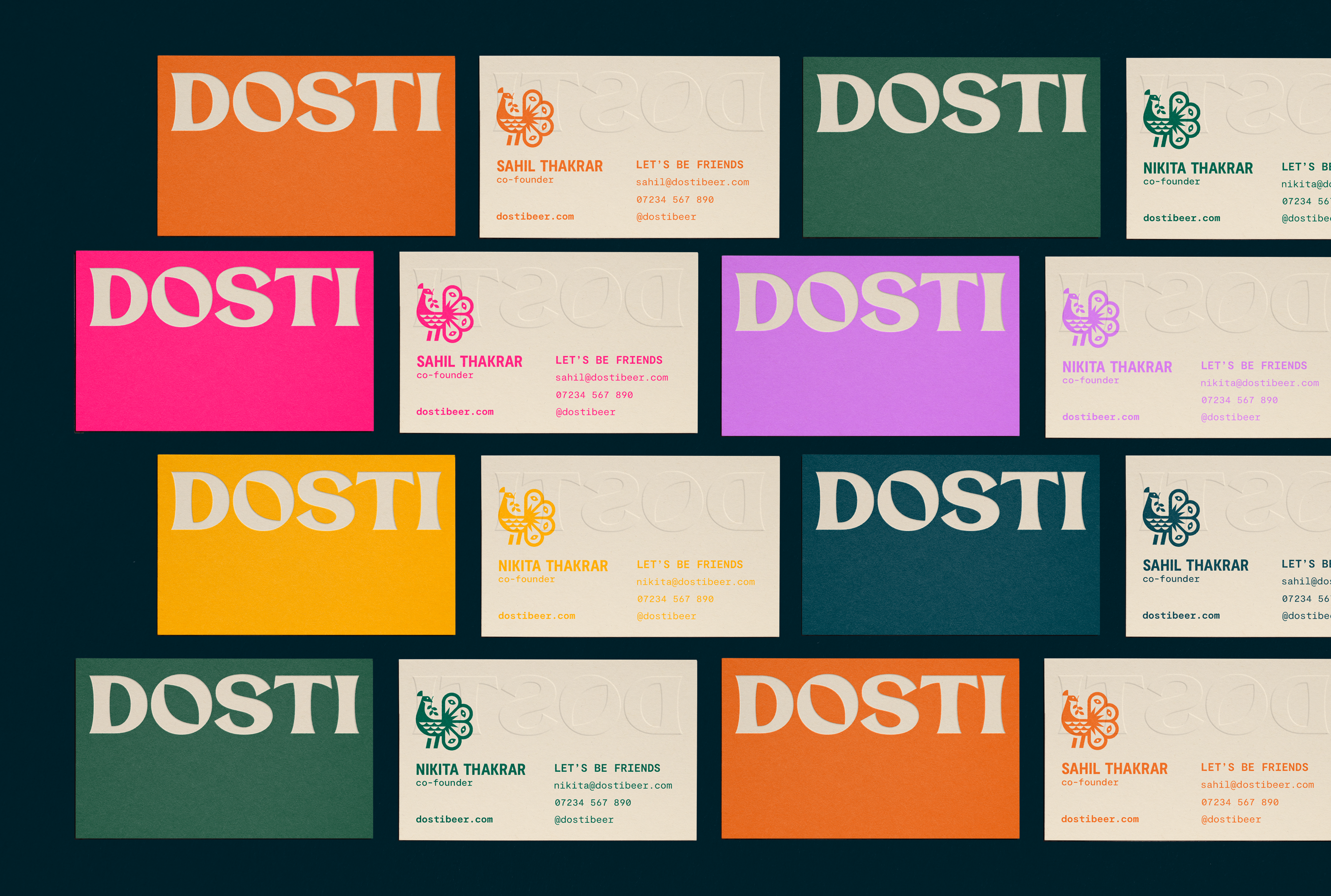
The goal with this logo was to create something that felt proudly Indian, but not in the way you would typically imagine it. It had to lean into that heritage without relying on the usual clichés. It had to feel modern, bold, simple, geometric but somehow, genuinely different. This has to be one of the hardest things to get right as a logo designer, and its what most clients of mine want to achieve. So that was a real challenge of mine when it came to the execution of this mark.
I was aware that this new beer brand wasn’t just for an Indian audience. It had to connect with a wide, mostly British crowd, people who could recognise its roots, but feel like it was made for them too.
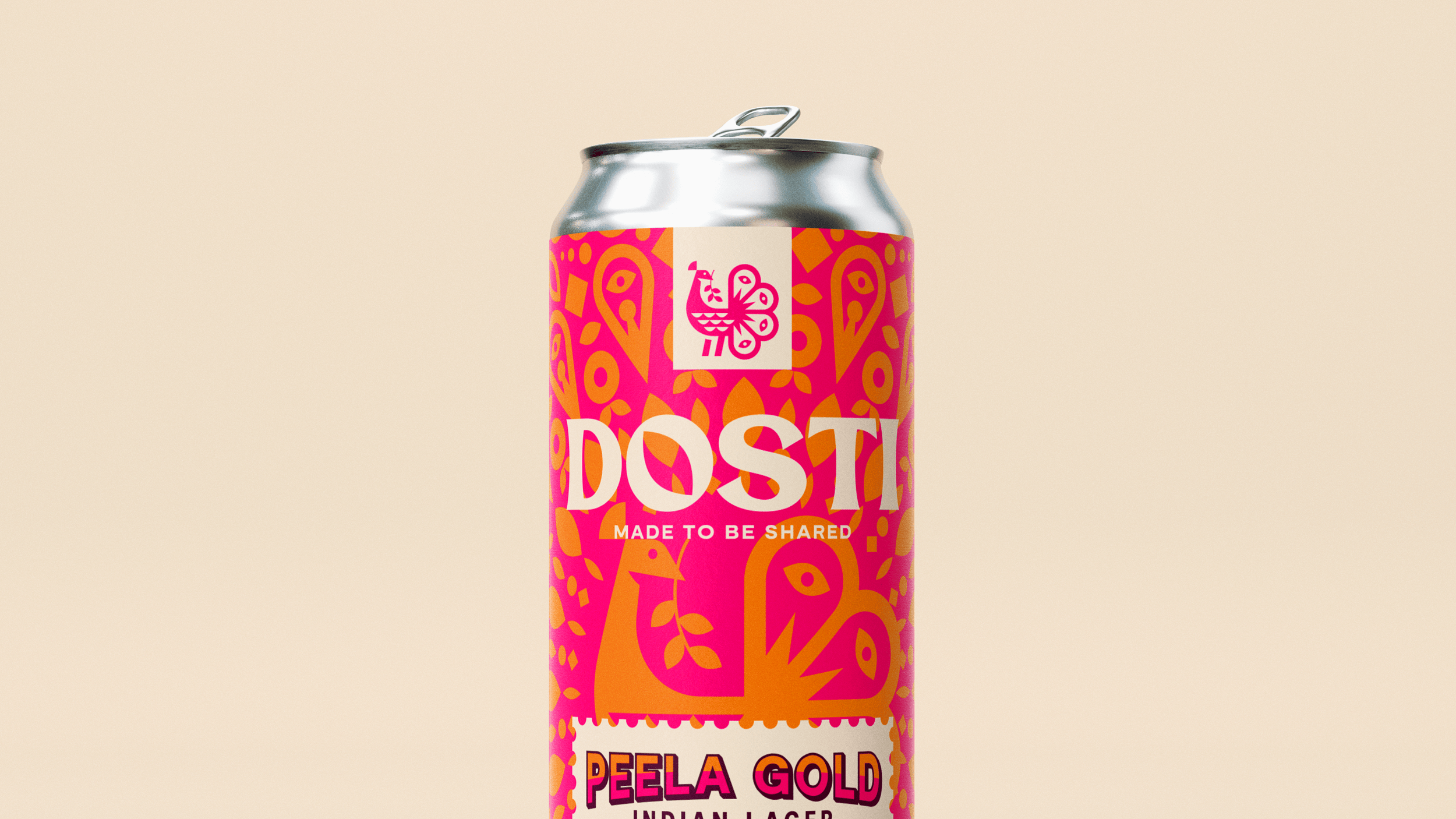
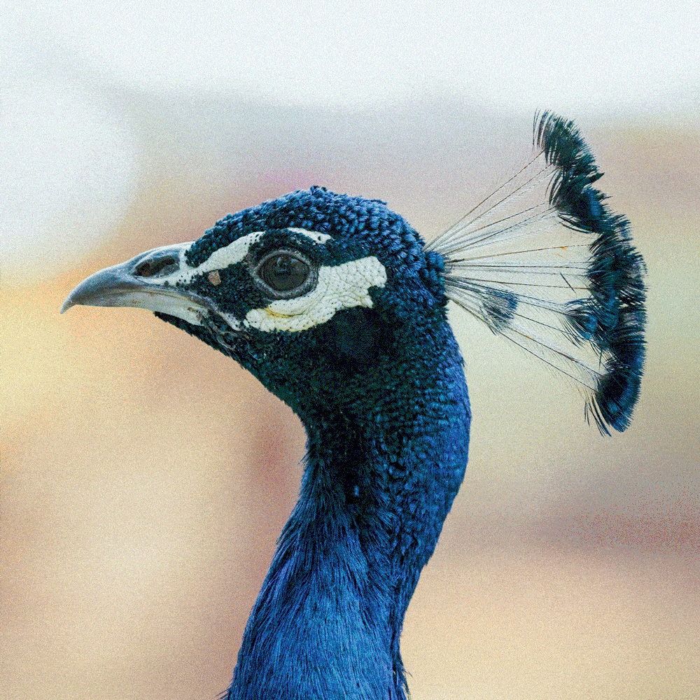
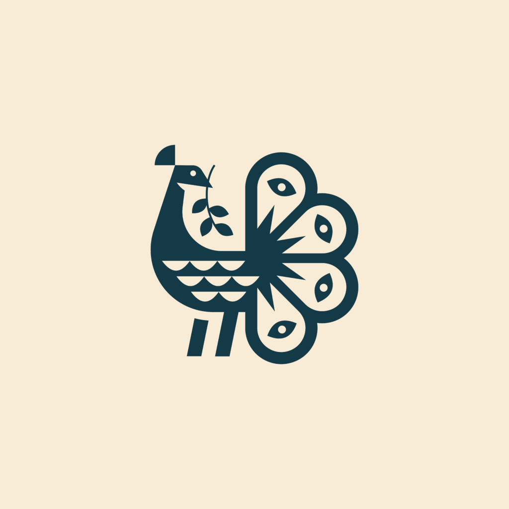
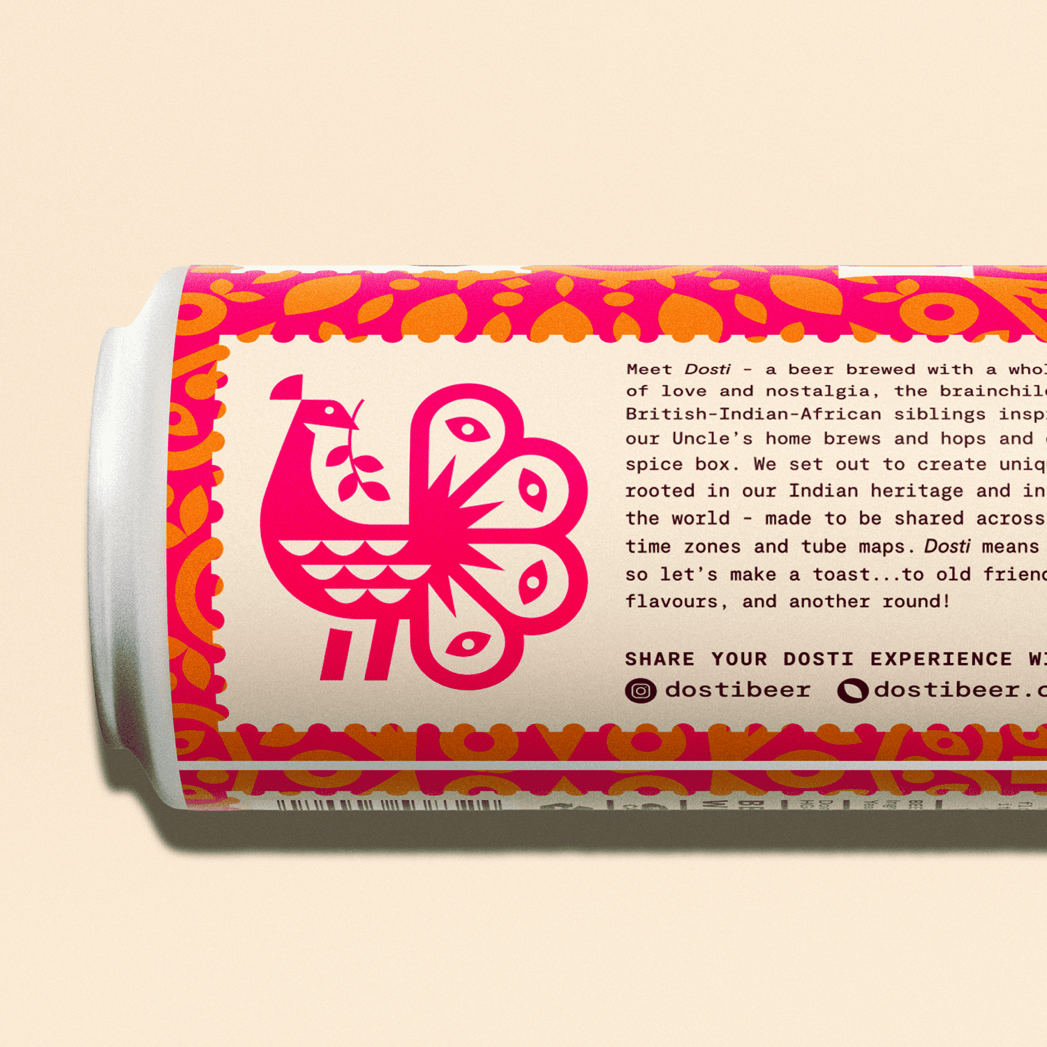
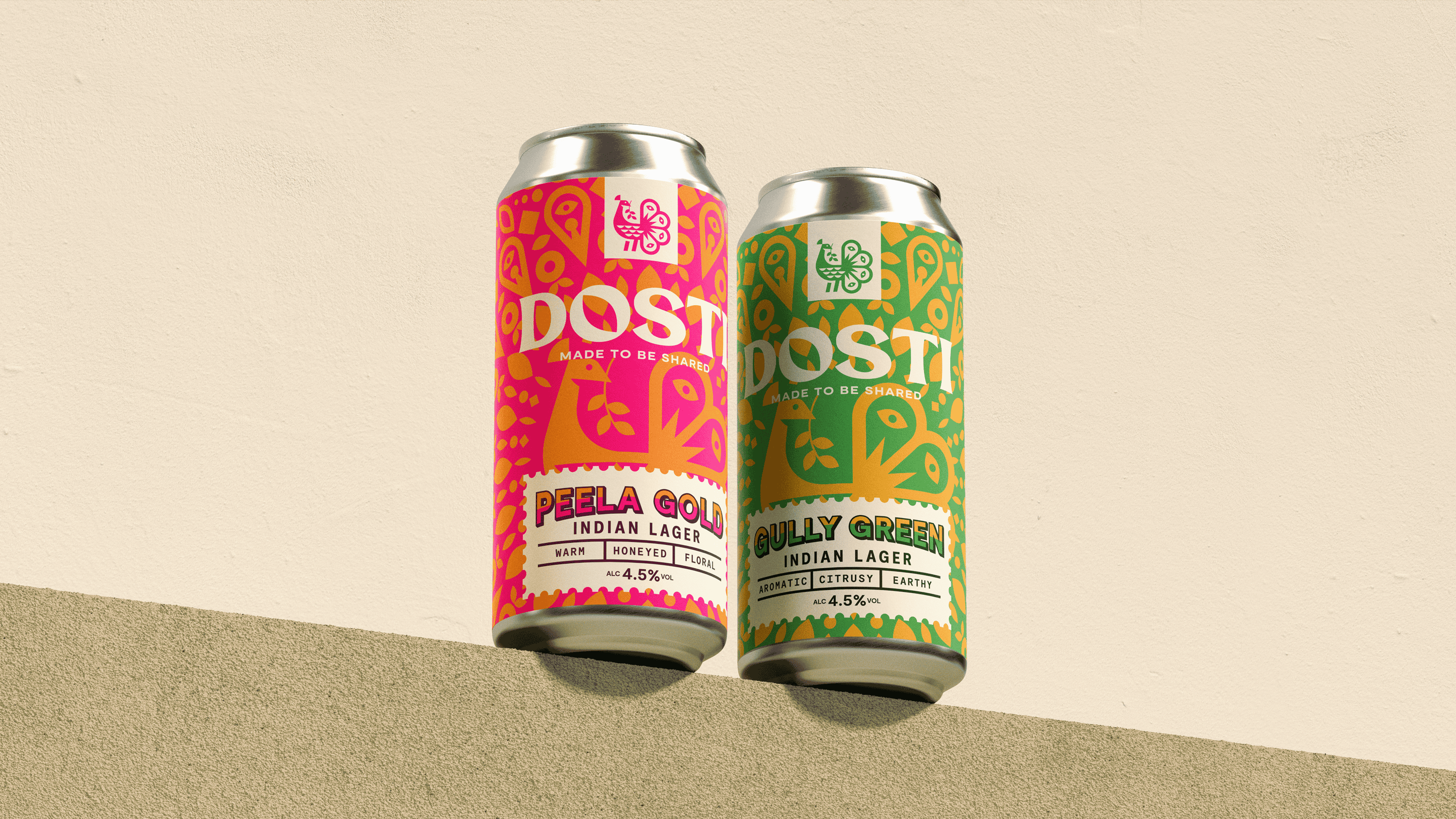
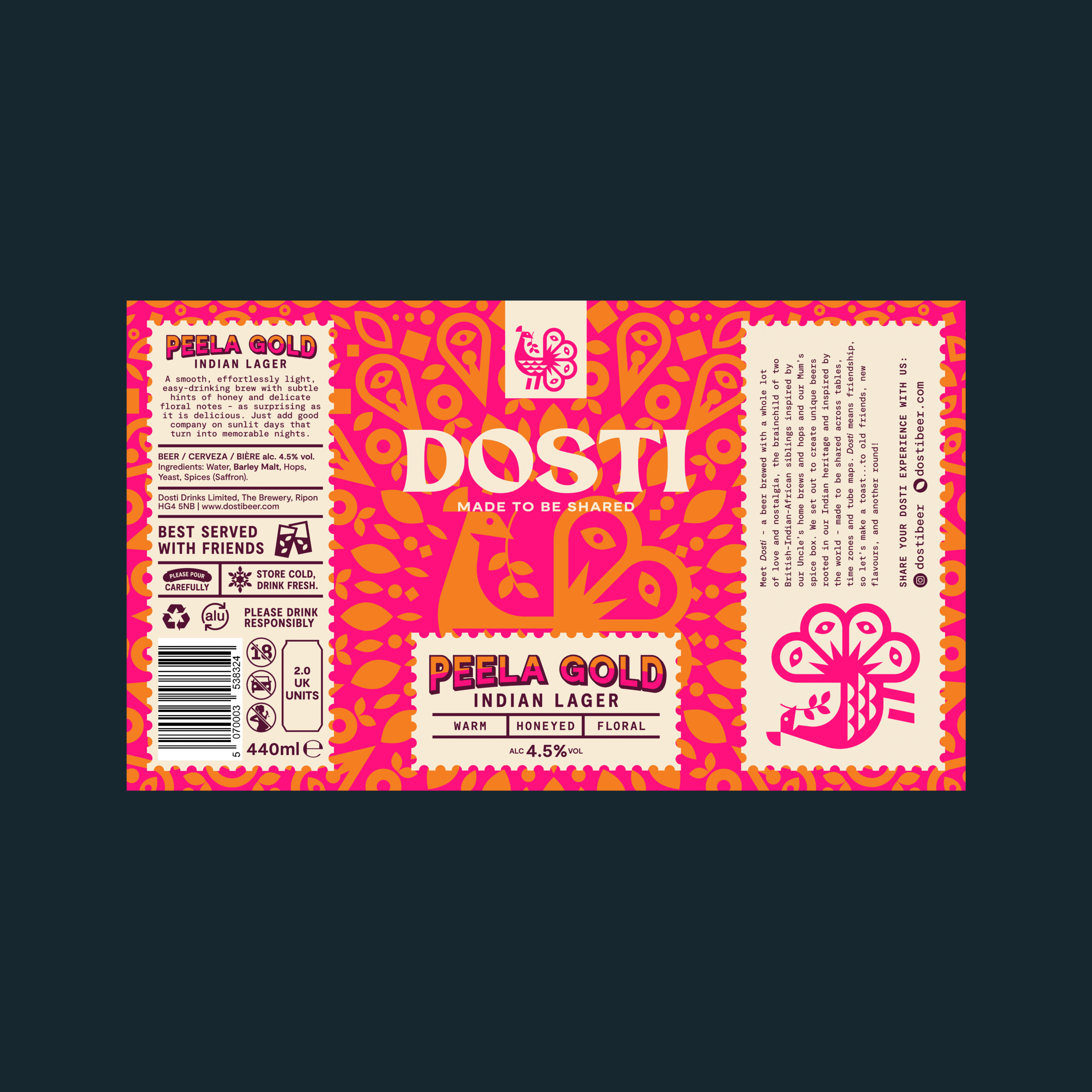
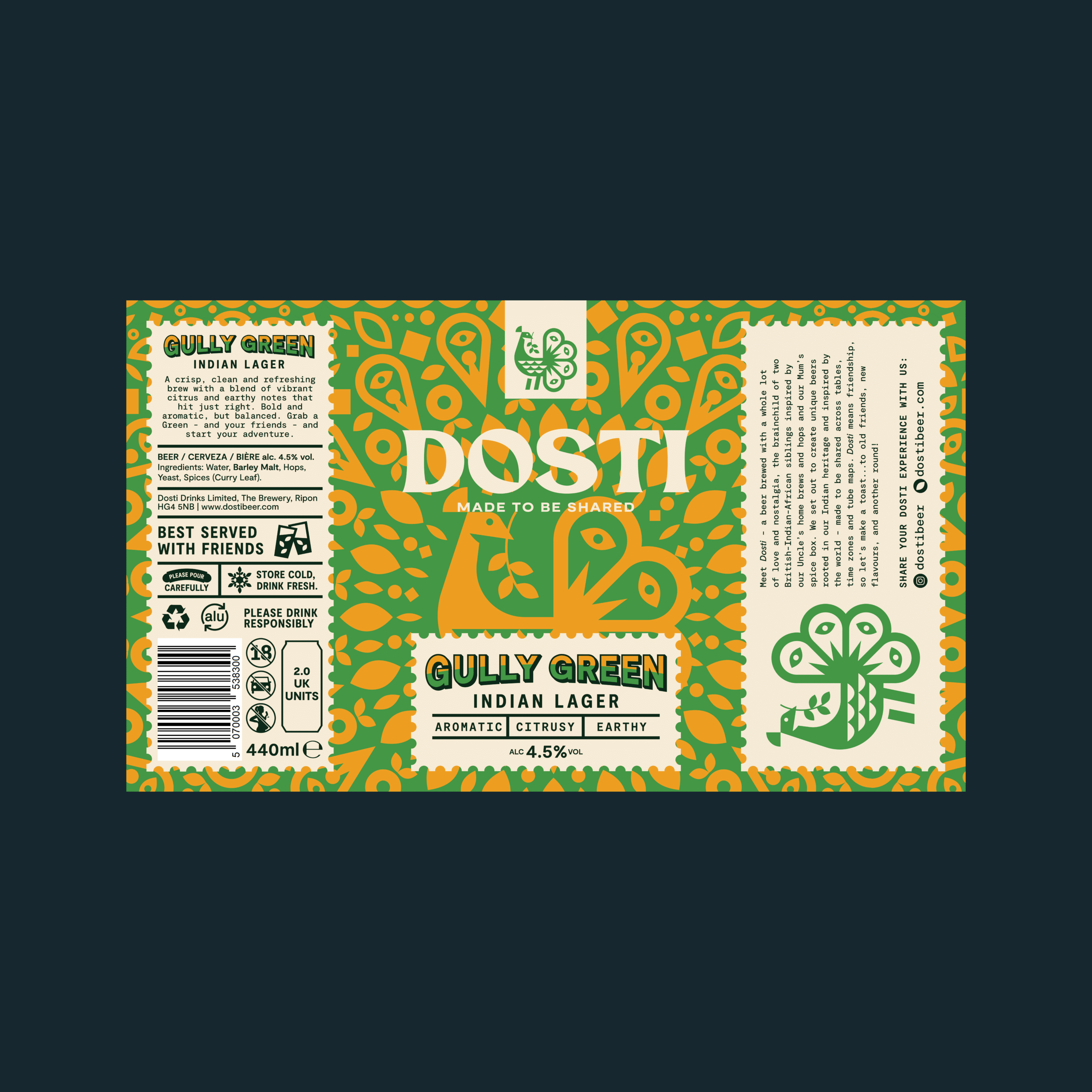
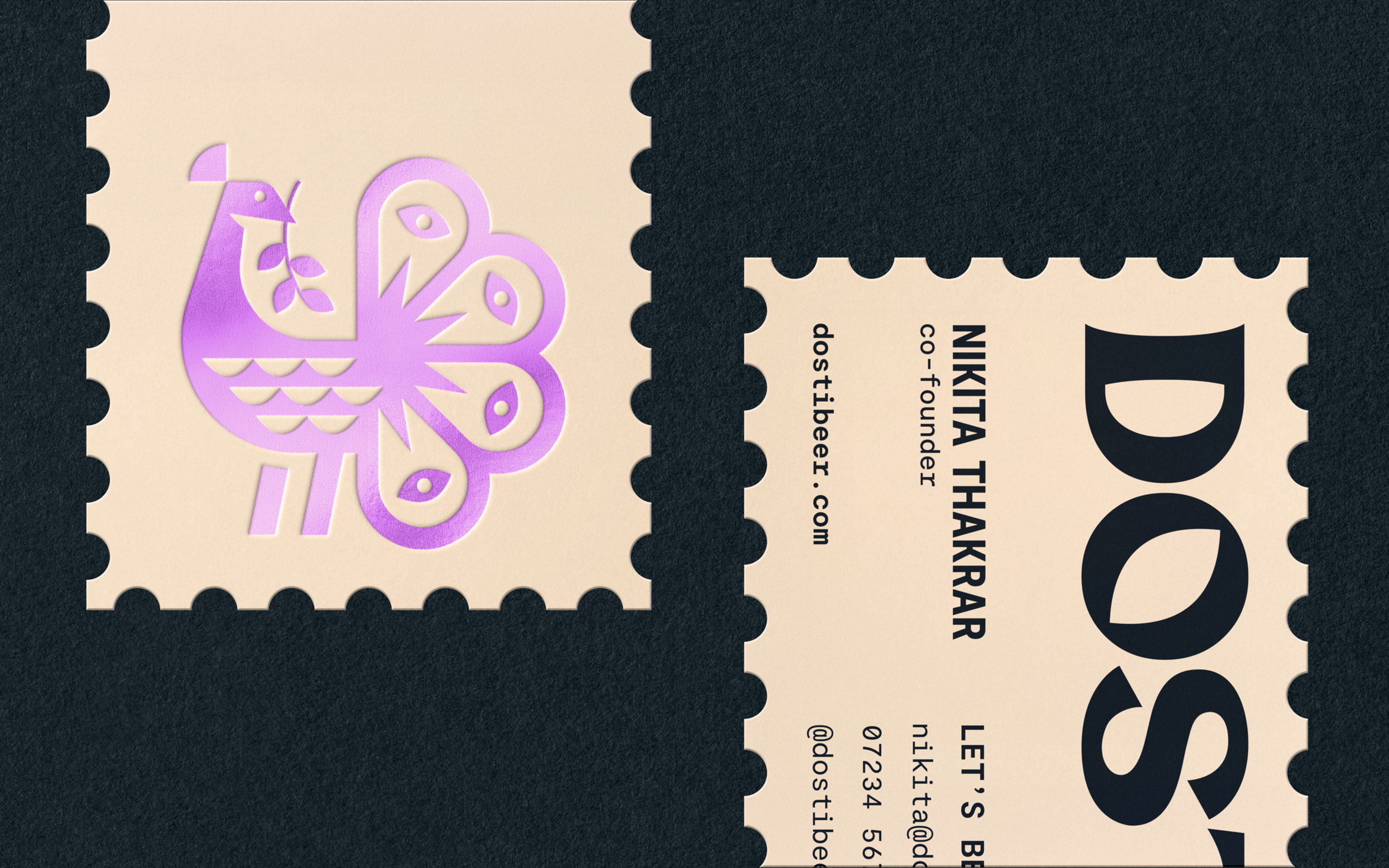
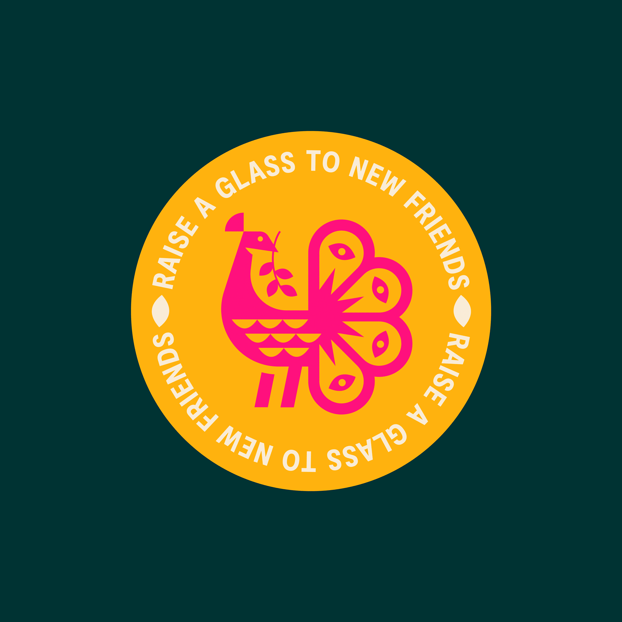
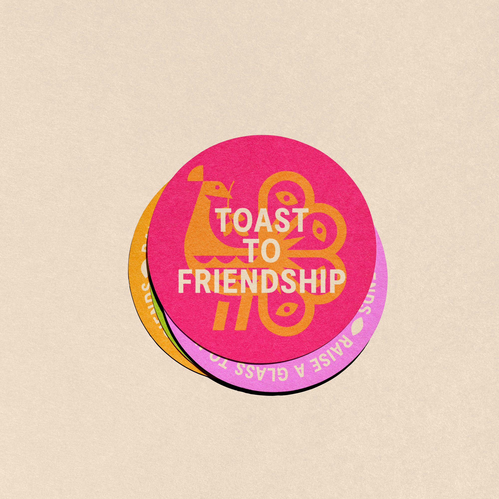
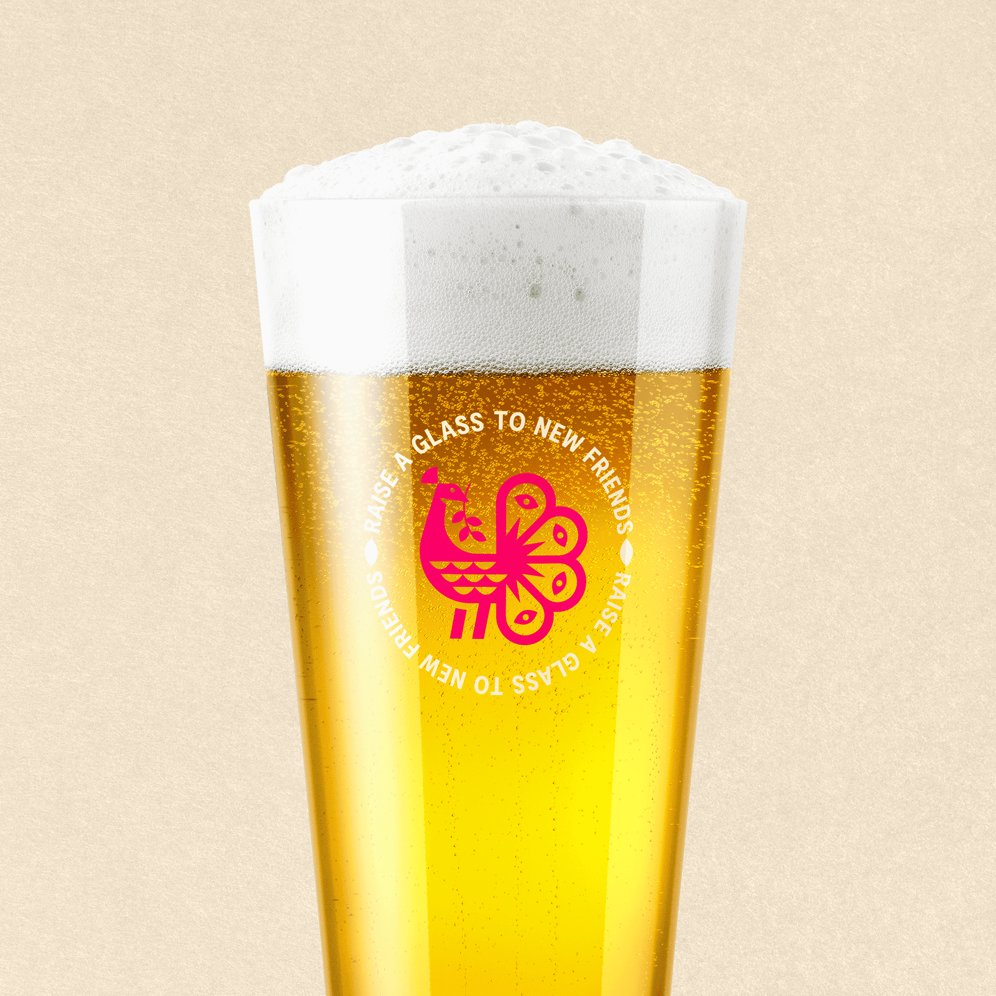
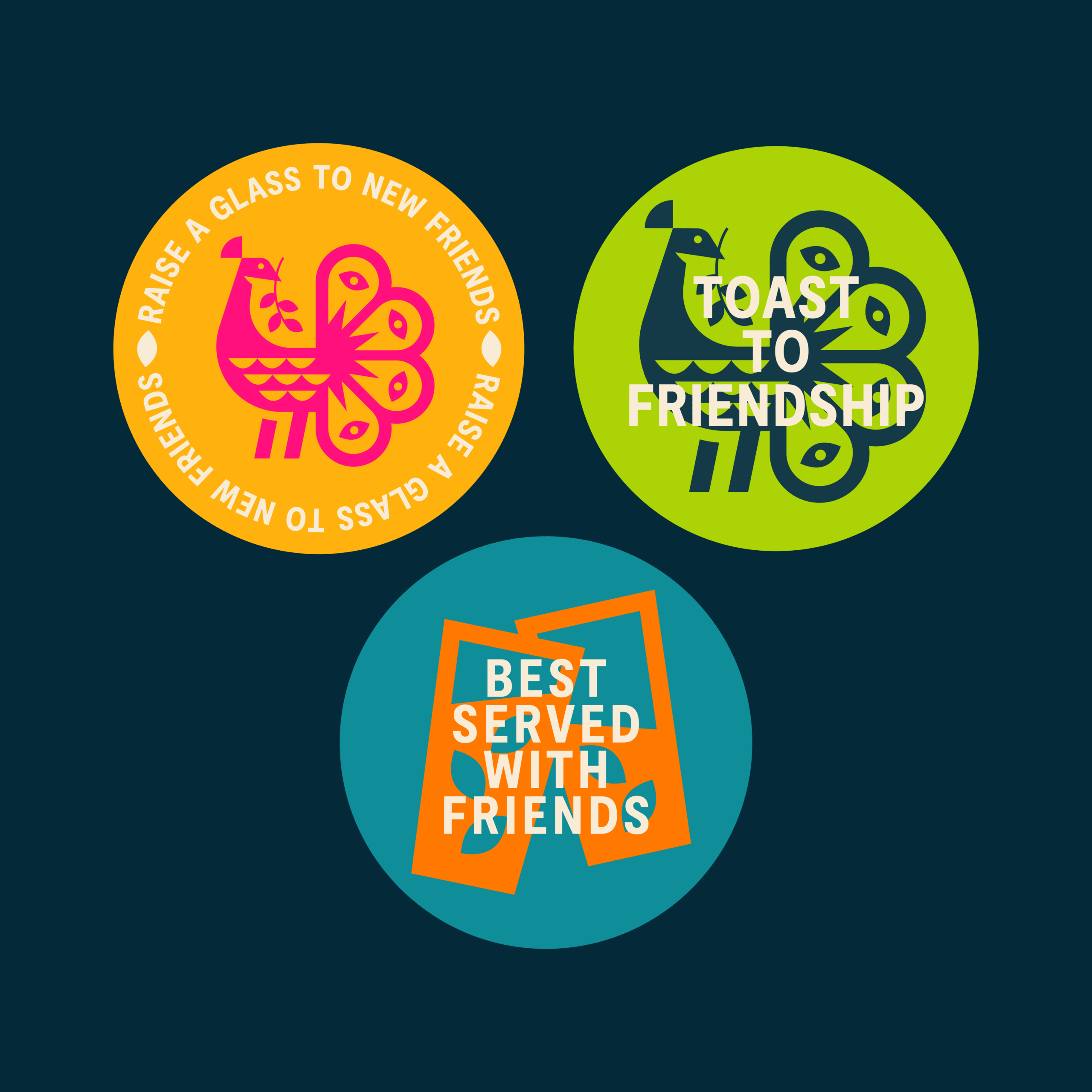
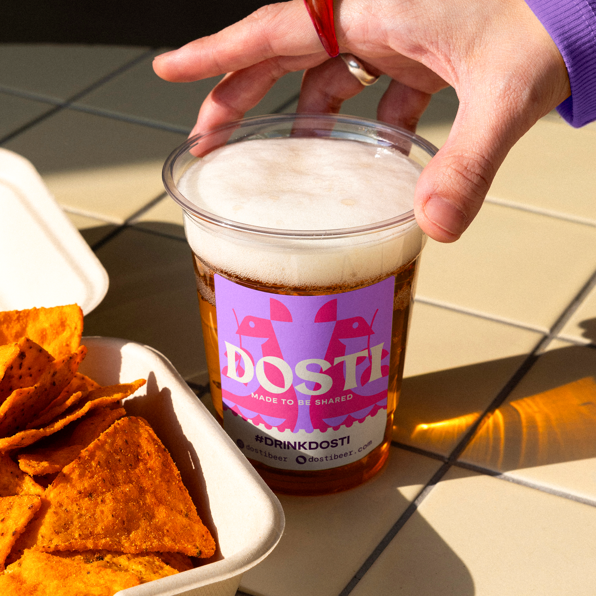
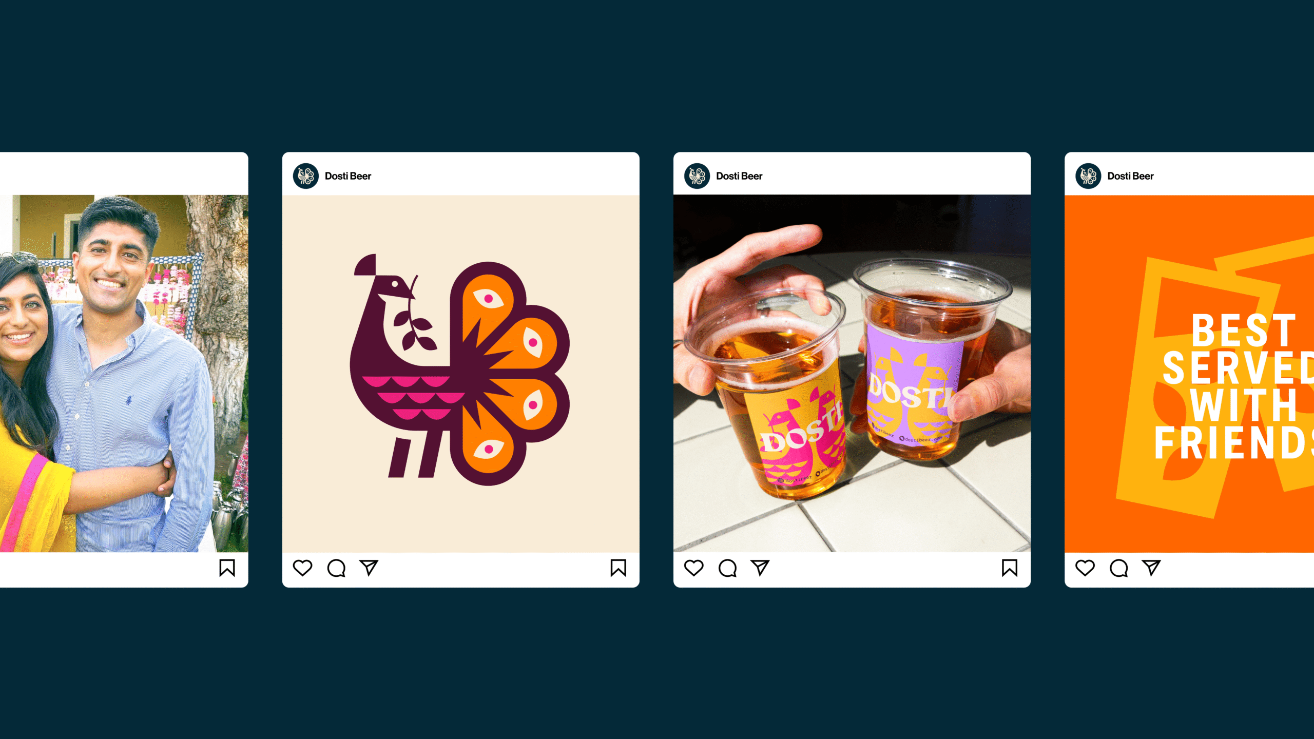
Nikita, Sahil and I didn’t want a mark that relied on typical beer imagery. Things like hops or beer glasses. We wanted a story. So I started with the peacock, India’s national bird. A powerful, proud symbol. But In order for this mark to be ‘genuinely different’ I need to make it Dosti’s peacock.
I started digging into Indian traditions and looking for symbols of friendship. Since Dosti literally means “friendship” in Hindi, that theme lead me on to find the Tulsi plant. It’s a sacred plant in India, often found at the entrance of homes or gifted as a sign of protection, connection, and welcome. It’s tied to care, and warmth. Everything this brand stands for. That became one of the core elements of the mark, a peacock, holding a Tulsi branch in its beak, like it’s offering something to you.
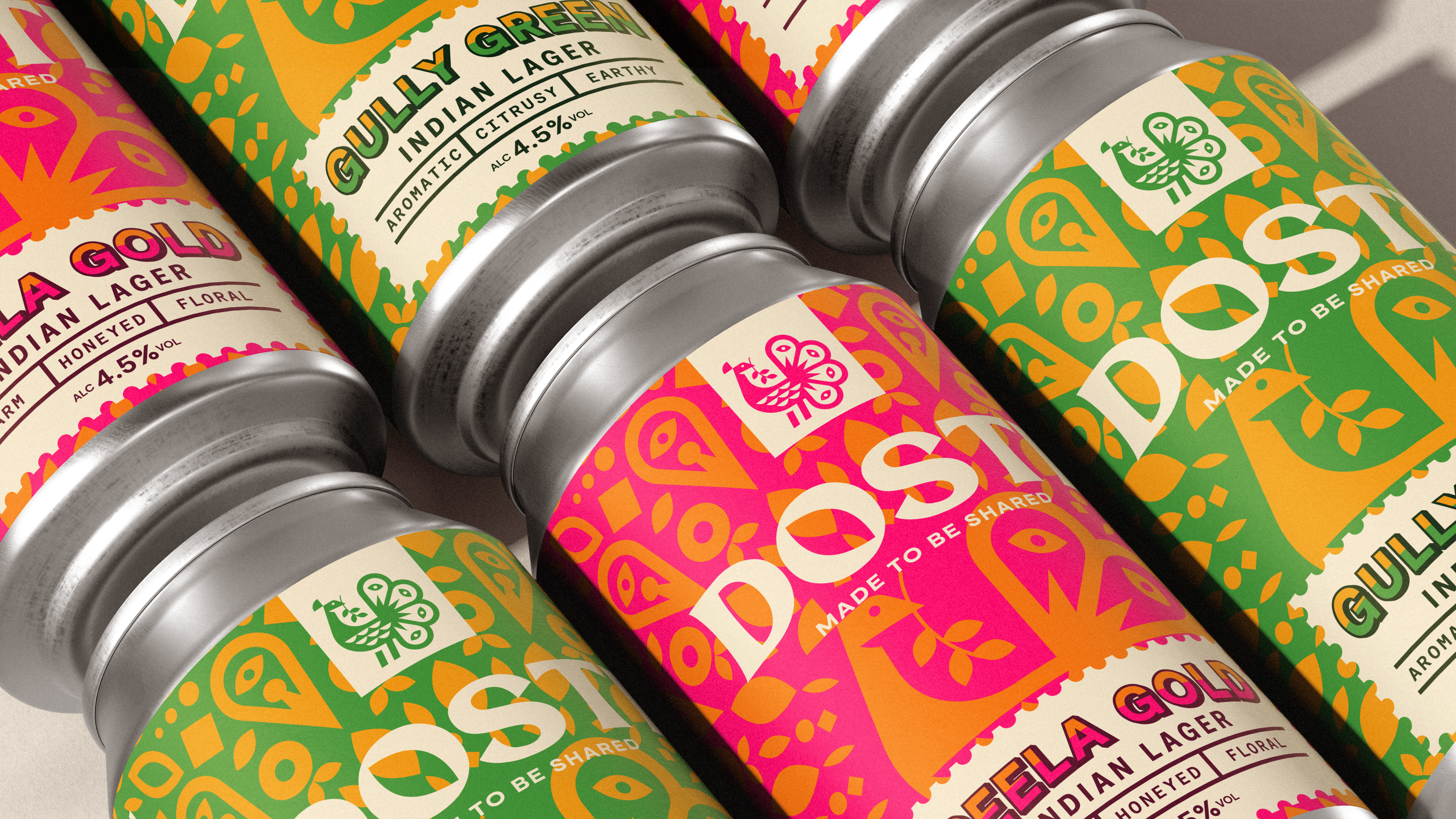
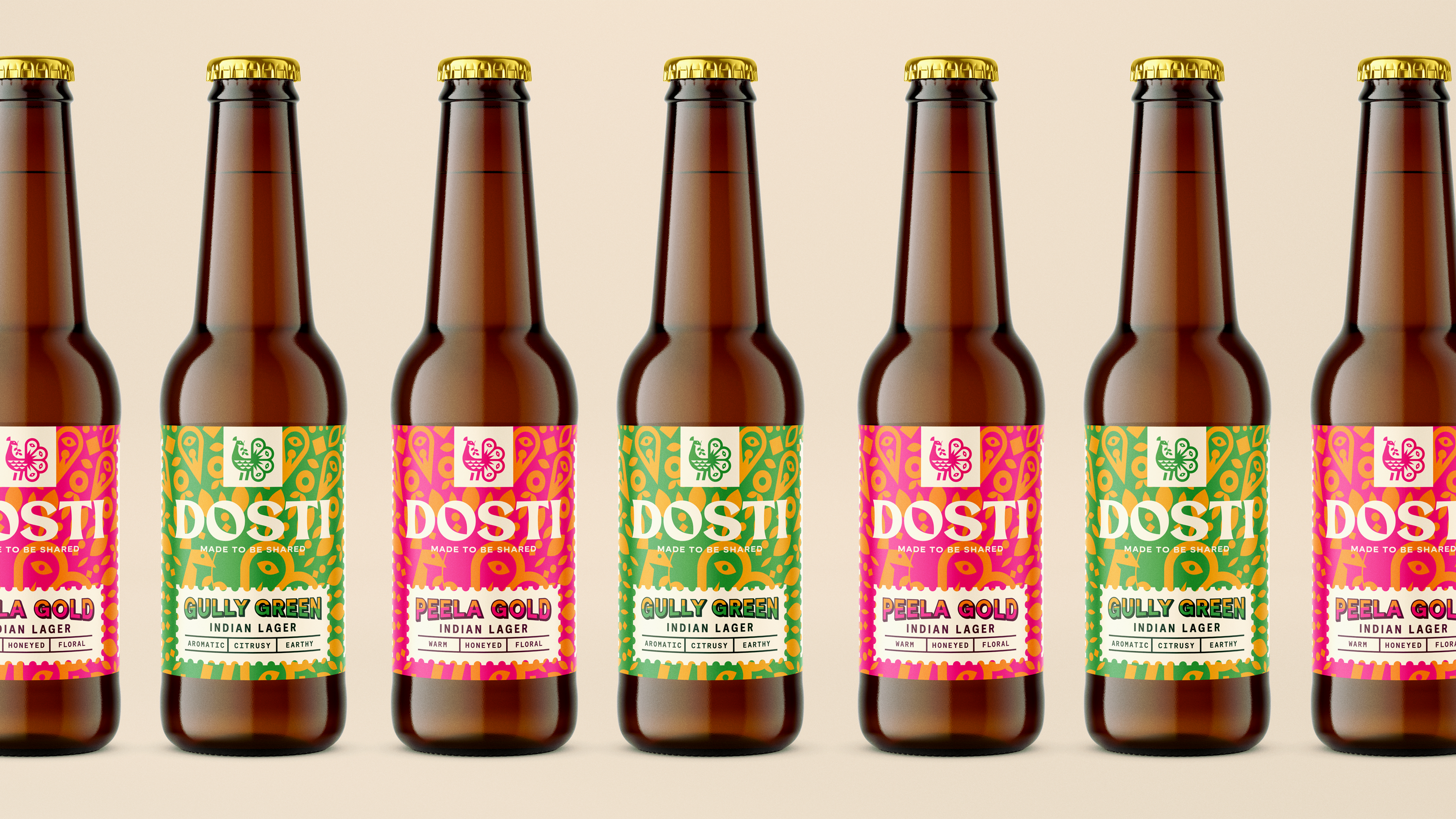
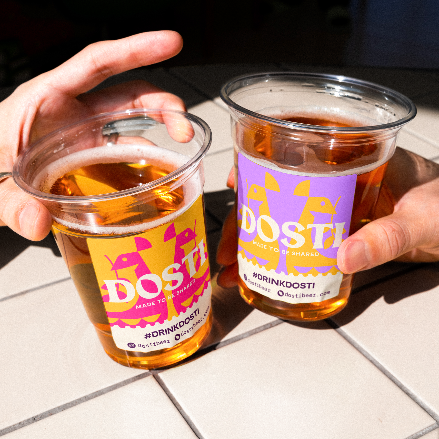
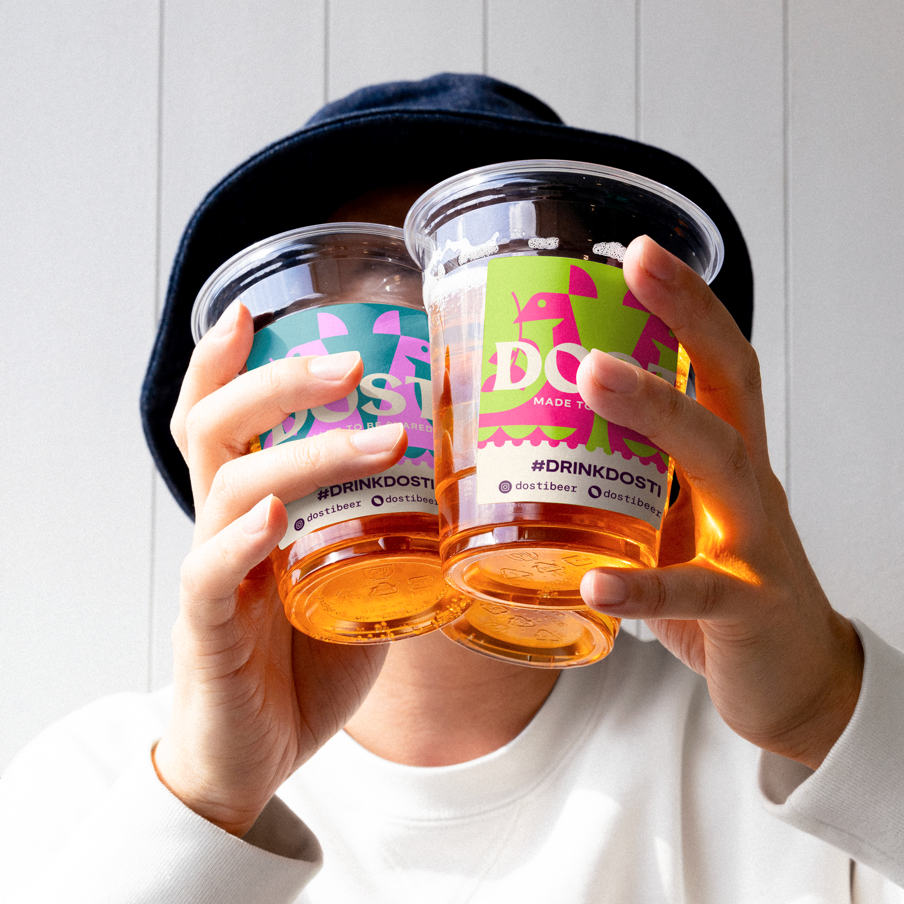
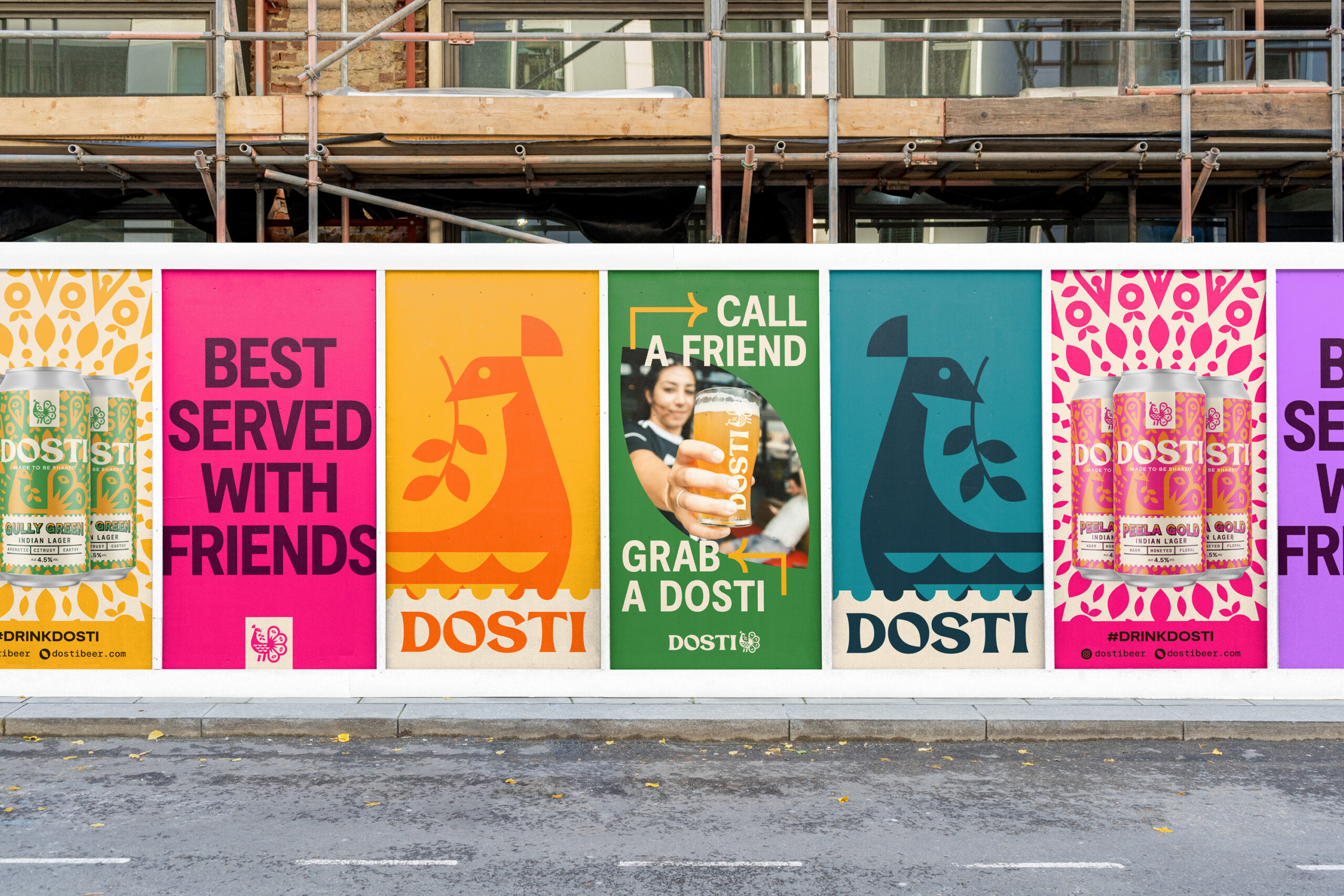
Then there was this idea of festivity. Dosti isn’t a quiet, introverted brand, it’s loud, colourful, made to be shared and celebrated. So I started looking at mandalas and rangolis. You see these beautiful markings during festivals and celebrations across India. There’s the rhythm I’m looking for. A sense of movement and joy. That was the energy I needed to make this very geometric, simple mark, feel alive.
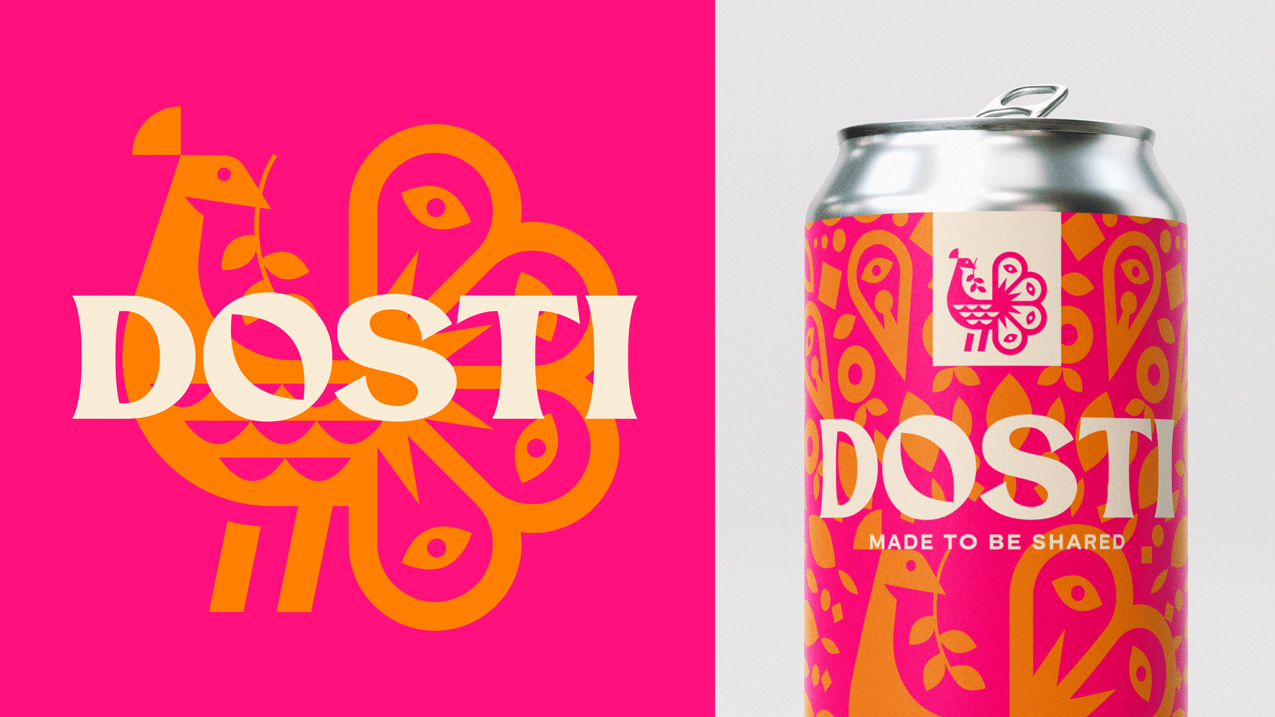
So I had three core ingredients: the peacock, the tulsi, and the mandala. And the challenge was blending all of that into a mark that didn’t look overly traditional. It had to feel like it belonged in a modern, western beer world, but with real cultural weight behind it.
When it means this much, you build it yourself
I knew early on that I didn’t want to just grab an off-the-shelf typeface for the Dosti wordmark. This project meant way too much to me to cut corners like that. Truth is, I’m a proper beer nerd. I’ve spent more Christmases than I can count in Belgium, drinking my way through every beer I can find, usually ending up in the beer museum learning how beer is ‘good for you’. Funny enough, that’s actually something I share with Sahil and Nikita too. So yeah, this one was personal. And when a project means that much to you, you want to give it everything you’ve got.
As this was a start-up brand, the name was arguably one of the most important parts to get right in this project. We needed people to learn this name. So I needed the wordmark to carry its own personality, something that would complement the peacock logo but still stand on its own. The peacock was clean, geometric, modern, and bold. So I wanted the logotype to offer a bit of a contrast. Something with a bit more of a traditional feel, but still clearly built from the same world. That push and pull between modern Western design and traditional Indian influence had to come through, so the wordmark was the perfect opportunity to play in the world of tradition.
So I built it from scratch.
The type is completely custom. I designed every letter in a way that felt connected to the brand’s story. To make sure it felt unified with the peacock mark, I borrowed the shape of the Tulsi leaf from the bird’s beak and used it as a base to carve out the forms of each letter. You’ll see that same leaf shape in the centre of the O, and hints of it across the curves in the D, S, T and I too. Even the small circular eyes in the peacock’s tail inspired parts of the construction.
The end result is a logotype that feels grounded, expressive, and full of little details that link back to the brand. It’s not loud for the sake of it. It’s not trying to look clever. It’s just honest, considered, and part of the same story. And I really think that’s exactly what Dosti needed.


The visual identity of Dosti begins here
Getting the logo right was one thing, but packaging? That was a whole different challenge. Damn. This is what people actually see. It’s what they hold. It’s what gets passed across a table, stuck in a fridge, or lined up behind a bar. It had to be right. Not just good-looking.
Because I baked so much meaning into the peacock logo, that felt like the obvious place to start. The tail of the peacock was already inspired by mandalas and rangolis, so my initial reaction was – why not expand it? Why not build that into something bigger? In Indian culture, these patterns always start at the centre and grow outward. So I let the peacock sit at the heart, and built out this beautiful, detailed rangoli-style system using shapes from the logo, the tulsi leaves, the eye droplets, all of it. That became the base of the packaging design.
Then came the colour. Indian celebrations aren’t shy. The colour palettes are loud, bold, playful, sometimes wild. I was immedietly intimidated by the colours, but that was when I knew I was on to something truly disruptive. That was our chance to lean in and bring some of that spirit into the brand. I had two beers to design packaging for – Peela Gold and Gully Green. I ran with those names and built everything around them. Bright yellows, deep greens, strong contrasts. Each one had its own identity, but together they still felt like part of the same family.
This is the part where it all started to feel real. It went from just a logo to a full identity. Layouts, type, label shape, this was where it finally came to life. And because this was meant to be a premium beer, we didn’t stop at the visuals. We looked at everything: foils, textures, matte finishes, metallic inks, transparent labels, you name it, we tested it. I think we ran through over 30 variations before we landed on the final thing. But it was worth it.
The end result is a set of cans and bottles that tell a story before you even take a sip. They’re bold, full of energy, and packed with personality. And most importantly, they truly feel different to anything else out there. That was always the goal. And I’m truly proud of them.


Even the boring bits deserve meaning
With all the bold colours, the layered patterns, and the energy packed into the can, we still had to make sure this thing was usable. It’s easy to forget, but this isn’t just a pretty label, it’s a real product. People still need to find the name of the beer, the flavour, the alcohol percentage, ingredients, allergen info, and all the other legal stuff that has to be there.
But I didn’t want to just slap a plain white box on top of all this hard work. That felt lazy. I wanted even the practical parts of the design to feel connected to the brand and its story.
So I kept going back to this idea of sharing. Dosti means friendship, and this brand is all about giving something, passing it on, sitting around with your mates and cracking open a beer together. And then I started thinking about letters, and pen pals, and how special it used to feel to send or receive something in the post. It felt real. It felt considered.
That led me to the postage stamp, specifically Indian stamps, which are beautifully detailed and full of heritage. There’s something really symbolic about them. They represent something travelling, something being passed on. That felt like a perfect metaphor for what Dosti is all about – born from Indian roots, shared across the world.
So we created a stamp-shaped container. Not just a square box, but something with story baked into it. It became our way of housing the important information across the packaging without breaking the design. It sits on top of all the boldness, but still belongs there. It feels like part of the system.
It’s a small detail, but it’s one of my favourites. Because even the space that holds the boring legal copy carries meaning. That’s what I wanted with Dosti, everything intentional. No throwaways. No filler. Just real thought in every part of the design.


CHEERS To the work, the people, and the pints OF DOSTI
This is where the identity really comes to life across all the extra touchpoints that make a brand feel real. From the humble business card I designed to help land their first ever stockist, to the leave-behind packs, the beer coasters, the bar pump labels, the social ads, the copy, and even the brown cardboard delivery boxes. Everything was created with intention. Every colour combo. Every phrase. Every pattern.
Some of these colour combinations shouldn’t work. On paper, they clash. But somehow (and I’m still not sure how), together they create something exciting. Something that makes you look twice. And that’s kind of what this brand is all about. Being bold, unexpected, and unapologetically inviting.
All of these little pieces play into that bigger idea of Dosti. It’s a beer made to be shared. And not just with friends, but with strangers, with family, with people you haven’t met yet. Because life is richer when everyone is welcomed. That’s something Nikita and Sahil truly believe. And once they shared that with me, I knew this was the kind of project I’d put everything into.
As a designer, this is the type of work that sticks with you. The story, the people, the purpose, it all meant something. And that final message? That’s what I want people to take away from this:
Life’s better when it’s shared. Everyone’s invited.
Thanks for reading. I hope you enjoy the rest of the case study as much as I enjoyed creating this one.


