READ TIME: 9 MINS

MAKING BORING THE ENEMY

Anti-Boring Content Club is an influencer marketing agency based in Berlin, Germany, and they’re pretty much exactly what you’d expect from a company with a name like that. Bold, brave, slightly ridiculous and absolutely determined to make the world of content marketing a little less boring.

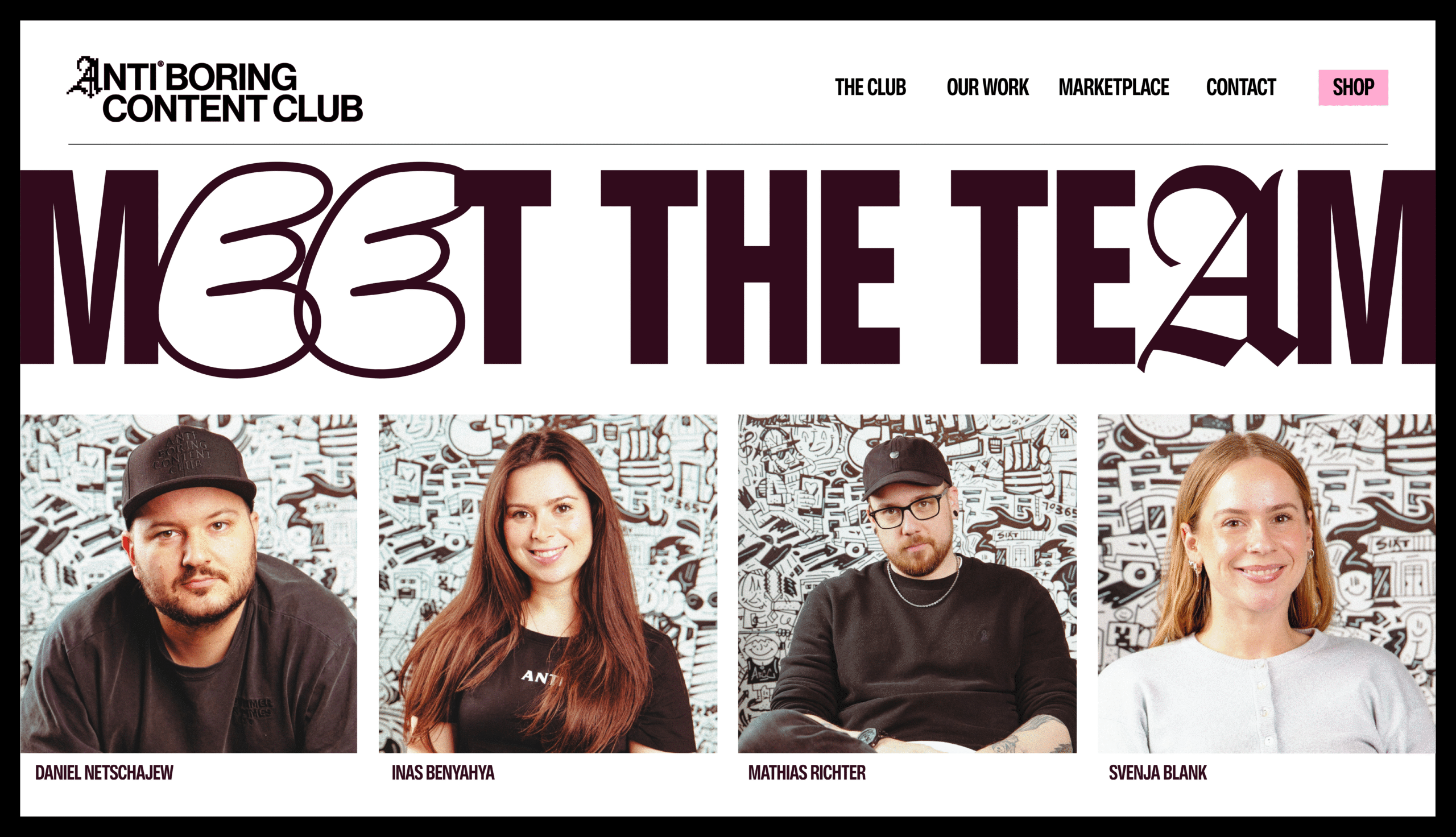
Led by founder Matthias, the team work with brands and creators to make content that people actually give a shit about. They’re big believers that creators should be allowed to create, rather than being handed painfully safe briefs from brands that are too frightened to try something different.

So when Matthias got in touch about rebranding Anti-Boring Content Club, I was pretty bloody excited. This was one of those projects where the personality of the business was already so clear, and I knew there was going to be plenty of room to have some fun.

But with a name like Anti-Boring, how do you actually create an identity that lives up to it? Simply making something loud or weird wasn’t going to cut it. I wanted every part of the identity to have a reason for looking and behaving the way it did.

And, as it turned out, the answer was to start by making something incredibly boring.

You can only steal someone's logo for so long.

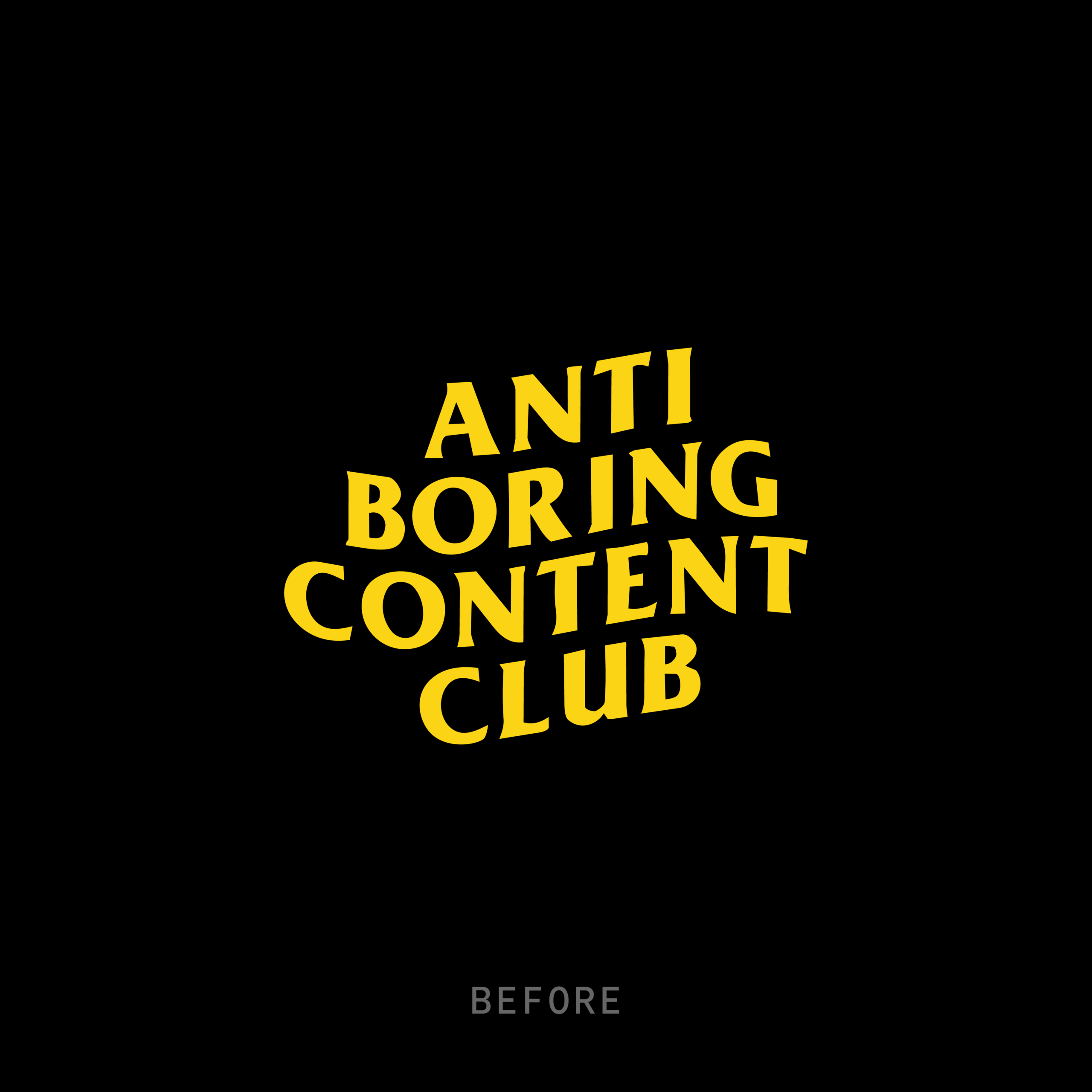
Before we started working together, Anti-Boring Content Club already had a logo. And the story behind it is probably one of the funniest things I’ve ever heard from a client.

Their original logo was essentially the Anti Social Social Club logo, with the wording changed to their own. But Matthias told me he’d actually contacted the owner and asked permission to use it, and apparently the answer was yes.

I mean, fair play. Even when they’re borrowing somebody else’s logo, they’re polite enough to ask first. Which probably tells you quite a lot about the sort of people I was working with.

But as the business grew, it became clear that borrowing somebody else’s identity was only ever going to get them so far. They needed something people could recognise as their own, something they could build recognition around and grow with.

I didn’t want to lose that rebellious attitude, though. It was one of the most important things about them. We just needed to find a way of expressing it that belonged entirely to Anti-Boring.

What if a boring company got taken over?

During our early conversations, one thing became pretty clear. Anti-Boring weren’t just trying to make better content. They were against all the things that make content boring in the first place. Safe ideas, unnecessary rules, predictable marketing and brands that won’t let creative people be creative.

I started thinking about what the complete opposite of Anti-Boring might look like. Some painfully ordinary corporate marketing agency, with a perfectly acceptable Helvetica logo, a black-and-white colour palette and absolutely nothing interesting to say about itself.

And then I wondered what would happen if Anti-Boring got their hands on it.

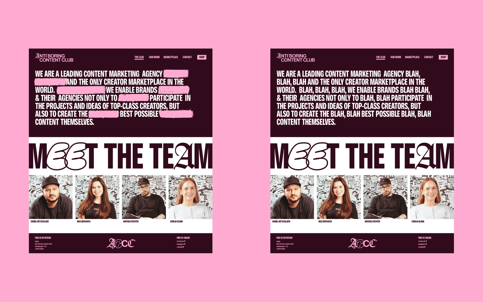
What if they came along and completely took over this boring corporate company? Like a bunch of digital pirates, hacking their way into the identity, spray-painting over logos, scribbling out information and replacing anything they didn’t like. Almost as if the original company had experienced a hostile takeover.

I loved that idea because it meant we weren’t simply making something that looked rebellious. We could actually show the rebellion happening. And considering these guys are based in Berlin, a city with such a strong history of graffiti and counterculture, it felt like a pretty appropriate place to start.

So that’s what I did. I designed something boring first, before letting Anti-Boring come along and fuck it all up.

A little bit of anarchy, built into a single letter.

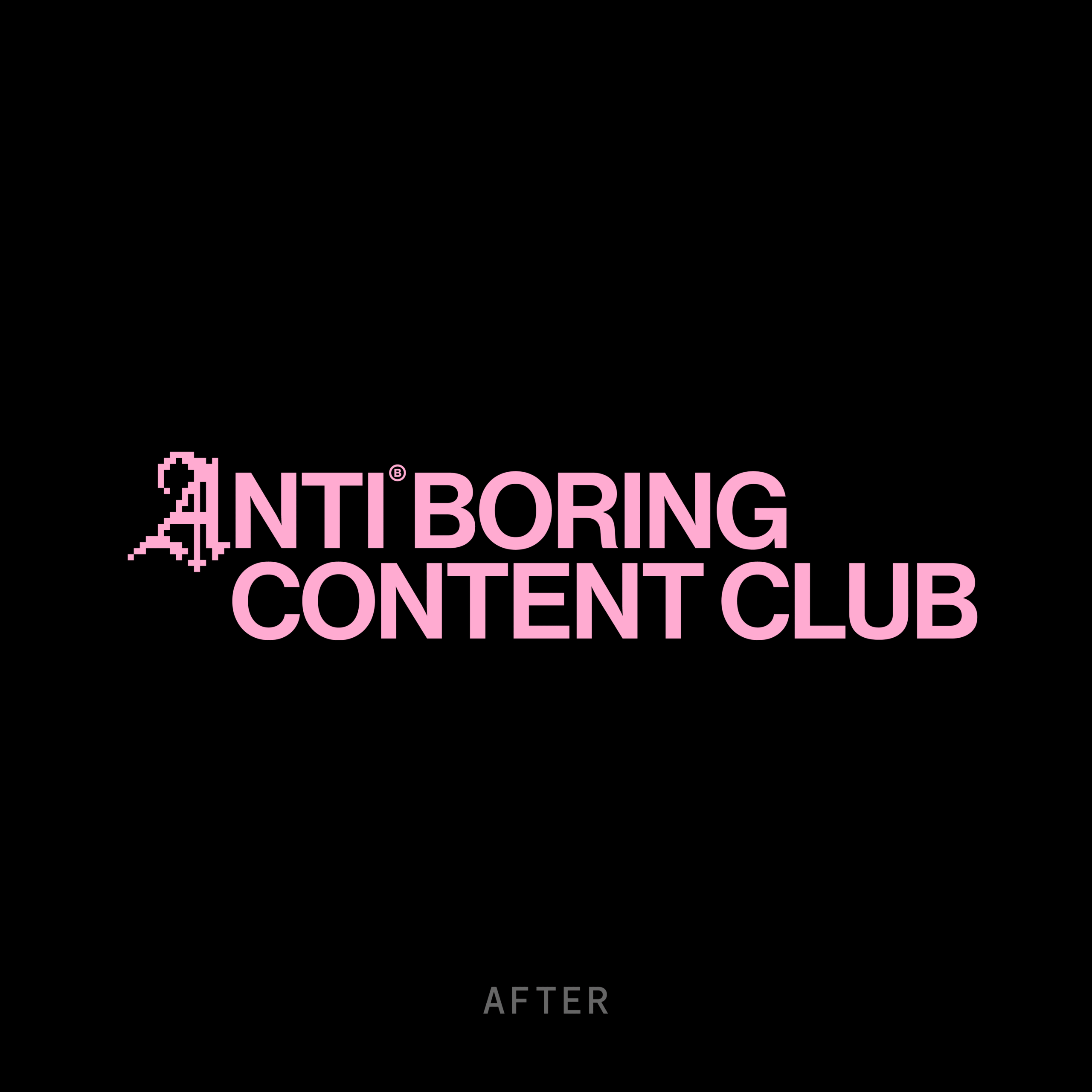
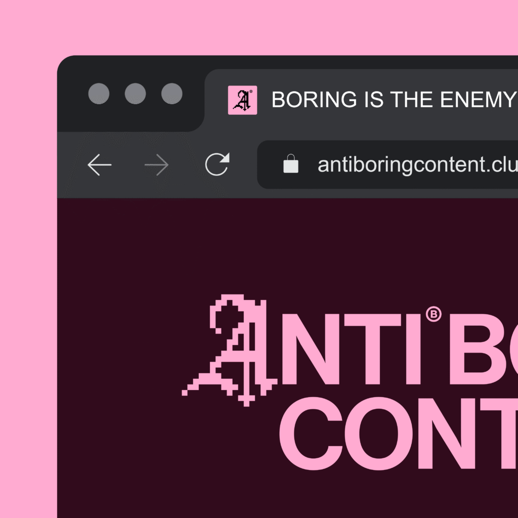
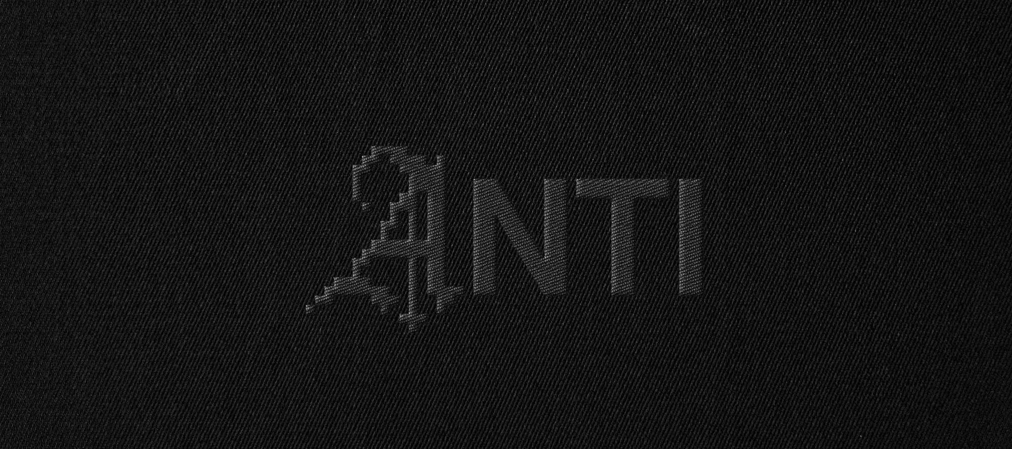
The first place I explored this idea was the logo itself. I wanted the foundations to feel like they belonged to that imaginary corporate business we’d just taken over. A clean, conventional sans-serif wordmark that could sit comfortably alongside a thousand other company logos.

But I needed something to interrupt it. Something that looked like it had absolutely no business being there.

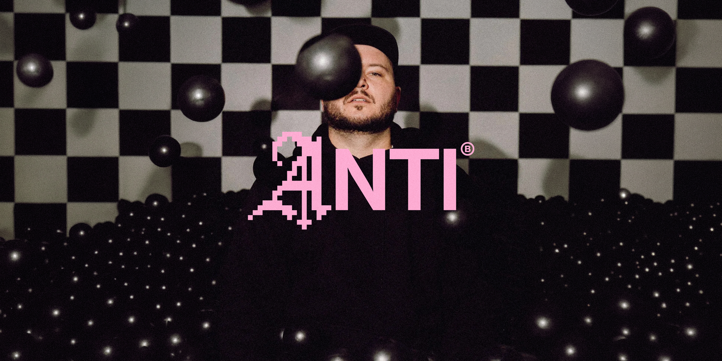
That’s where the A symbol came in.

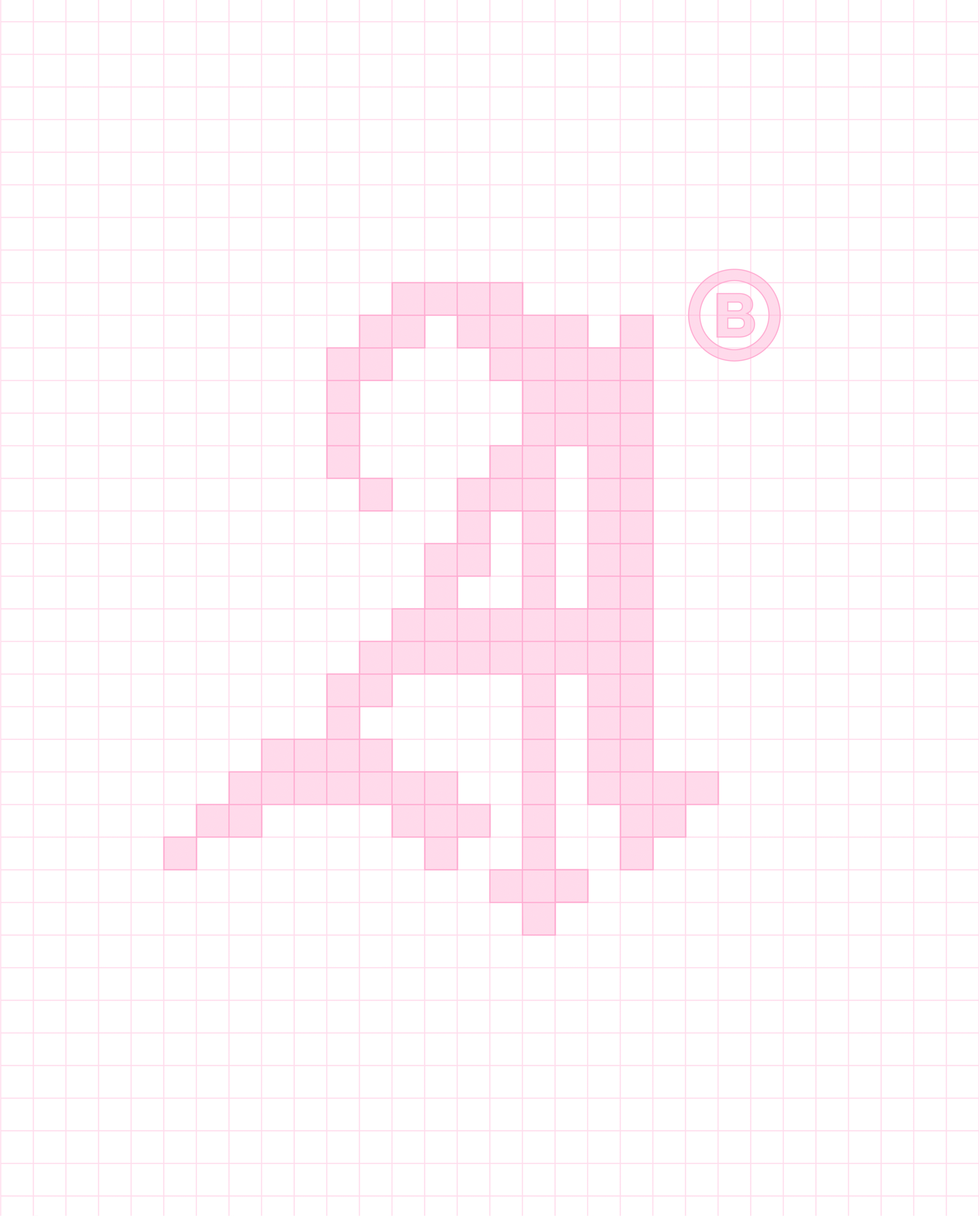
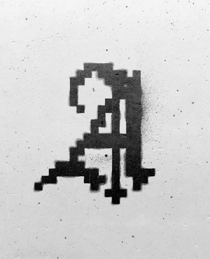
I started looking at traditional Blackletter typography, something that’s been around for hundreds of years and has this beautiful, intricate, handmade quality to it. And I loved how different it felt from the clean, digital typography we see everywhere today.

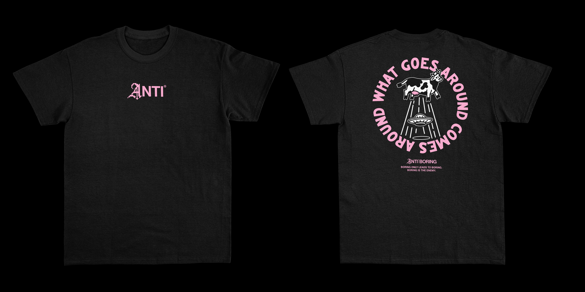
Anti-Boring work in the digital world, but their whole purpose is to bring more humanity and creativity into it. So I started exploring what would happen if I took this traditional Blackletter A and rebuilt it using pixels, combining something incredibly old with something entirely digital.

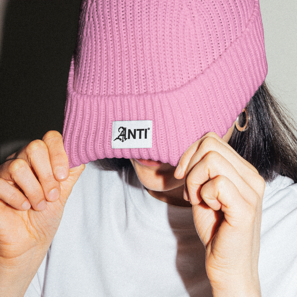
When I dropped that A into the otherwise ordinary wordmark, everything started to make sense. It looked like the original logo had been hacked. One part had been replaced by something that didn’t belong, and suddenly the whole thing felt completely different.

The logo wasn’t just representing Anti-Boring. It was demonstrating what they do. Taking something boring and making it a whole lot more interesting.

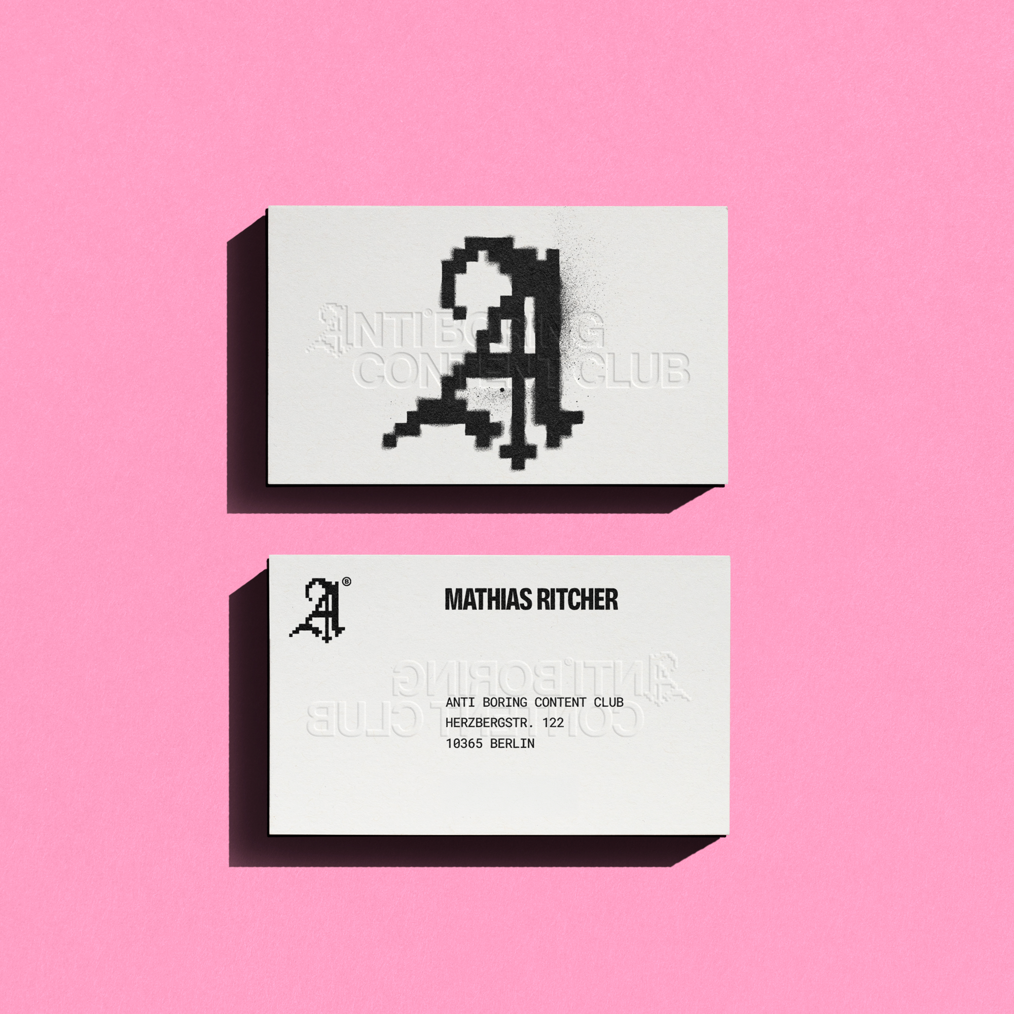
Even the business cards got vandalised.

One of the things I enjoy most about designing visual identities is finding ways to make even the smallest, most ordinary parts of a brand tell the same story. And what’s more ordinary than a business card?

I kept thinking about that scene in American Psycho where Patrick Bateman and his colleagues are comparing their incredibly clinical, corporate-looking business cards. So I thought, what if we designed something that looked exactly like the sort of card those guys would be proud of?

And then ruined it.

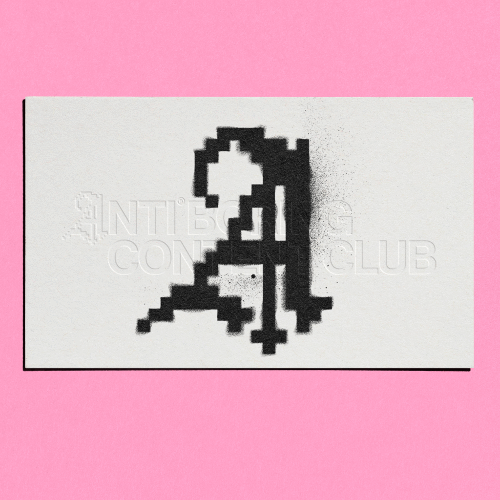
Rather than printing the Anti-Boring logo neatly onto the surface, I wanted the A symbol to look like it had been spray-painted straight onto the card. Almost as if somebody had broken into the printers and vandalised the whole batch before they went out.

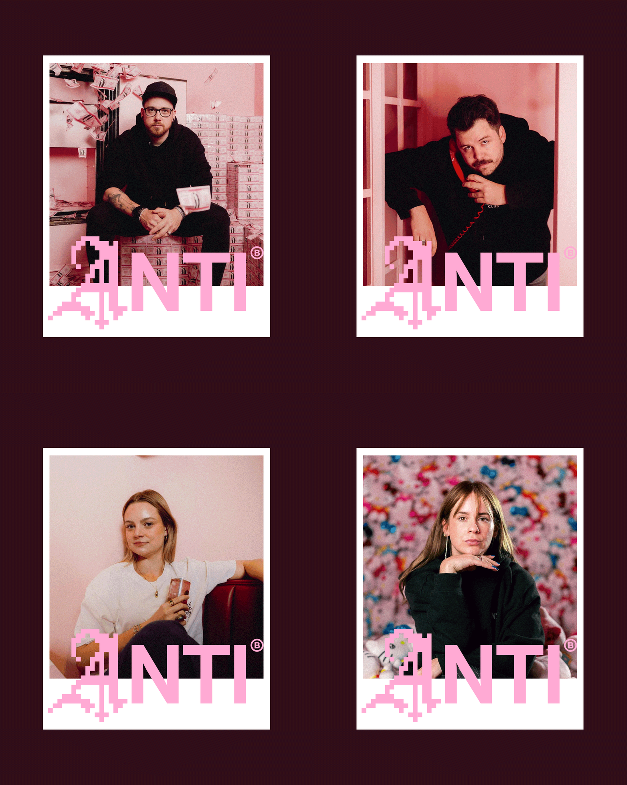
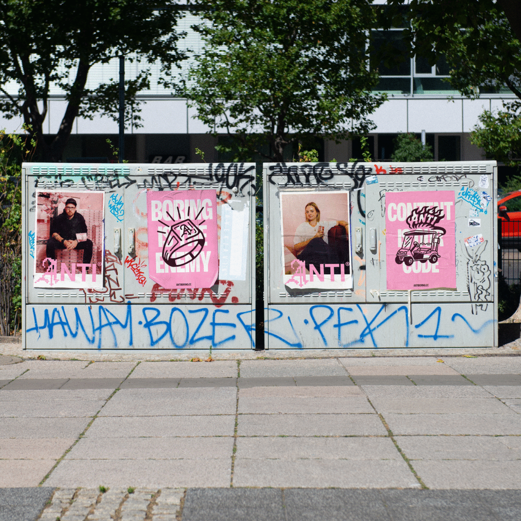
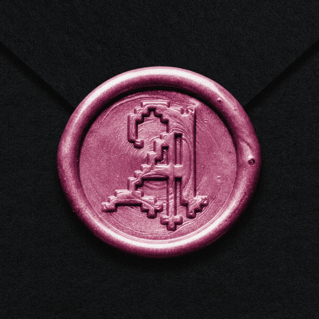
That same thinking carried into the identity through things like wax seals, stamping, handwritten marks and graffiti. All these wonderfully physical, human processes that felt completely at odds with the digital world Anti-Boring work in.

There was something quite satisfying about taking a perfectly respectable piece of corporate stationery and deliberately making a mess of it.

Giving the rest of the identity the same treatment.

Once the logo started coming together, I had a pretty clear idea of how the rest of the identity needed to work. I wanted to create a system where we could take almost anything ordinary and find a way to make it a little more Anti-Boring.

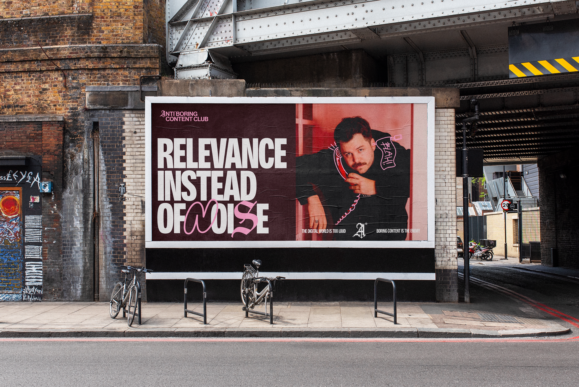
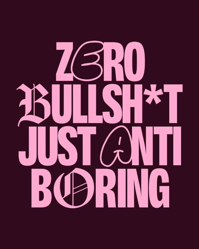
Typography was a big part of that. We could have these really conventional, neatly arranged pieces of text, and then suddenly a letter would change, something would get crossed out or a completely different style of lettering would appear. I particularly loved bringing together traditional Blackletter forms with graffiti-inspired typography, something that felt very much at home in Berlin.

But the illustrations were probably where I had the most fun.

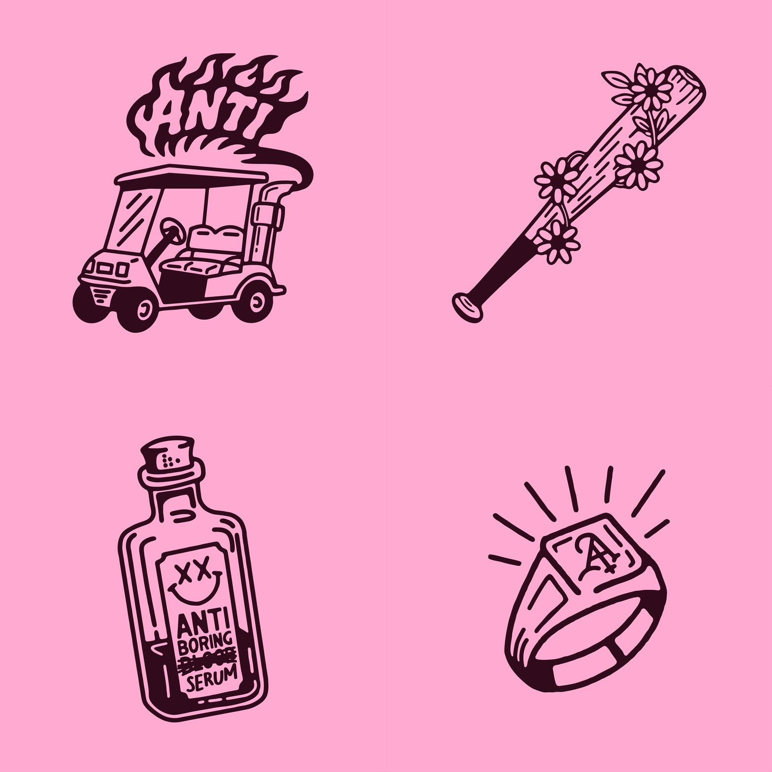
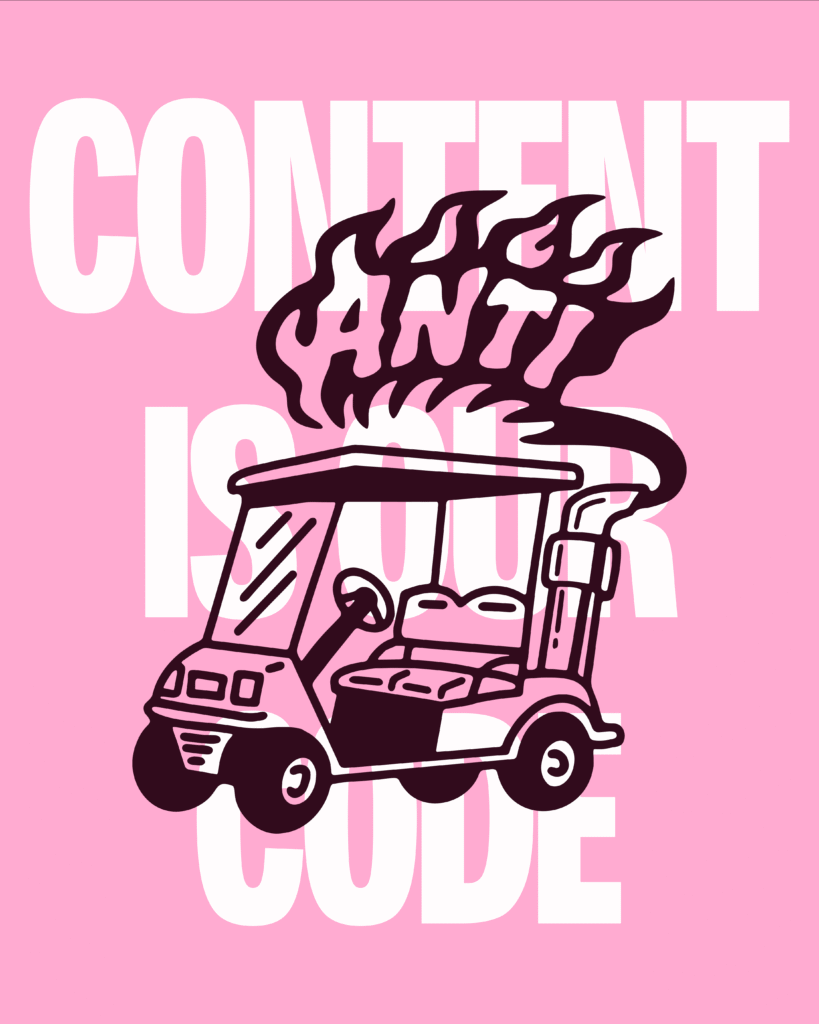
Matthias actually drives a road-legal golf cart around Berlin. I still think that’s fucking mental, but it gives you some idea of the personalities behind this business. And because a golf cart is about as slow and boring as a vehicle can get, I thought it’d be funny to turn it into something completely ridiculous. So I illustrated it with an enormous exhaust pipe shooting flames out the back, turning his little golf cart into an Anti-Boring machine.

We played with that same thinking elsewhere, like taking a baseball bat, something usually associated with being intimidating, and wrapping it in daisies instead of barbed wire.

I loved that this identity gave us permission to do some genuinely silly stuff, while still having a clear reason behind it all. We were simply taking things people already recognised and changing something about them that they didn’t expect.

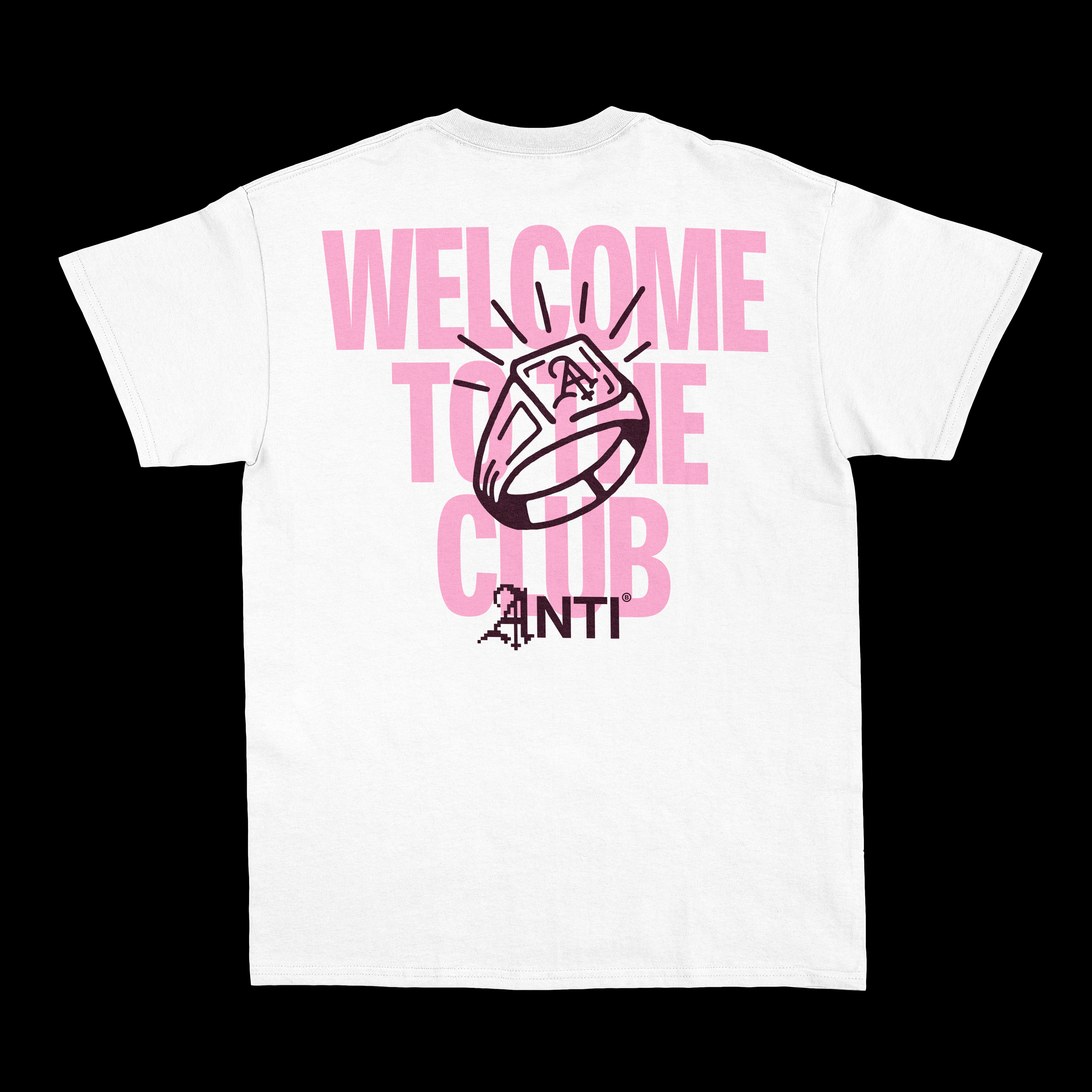
Welcome to the club. Things get weird here.

There was one other part of Anti-Boring Content Club I really wanted to explore, and that was the club itself. These guys weren’t just trying to build another influencer marketing agency. They wanted people to feel like they were joining something, a group of people who shared their belief that creativity should be exciting and brands should stop playing it so bloody safe.

I thought there was something quite funny about leaning into that idea almost to the point where it started feeling like some strange little cult. All those odd traditions, symbols and things that make you feel like you’re part of something other people aren’t.

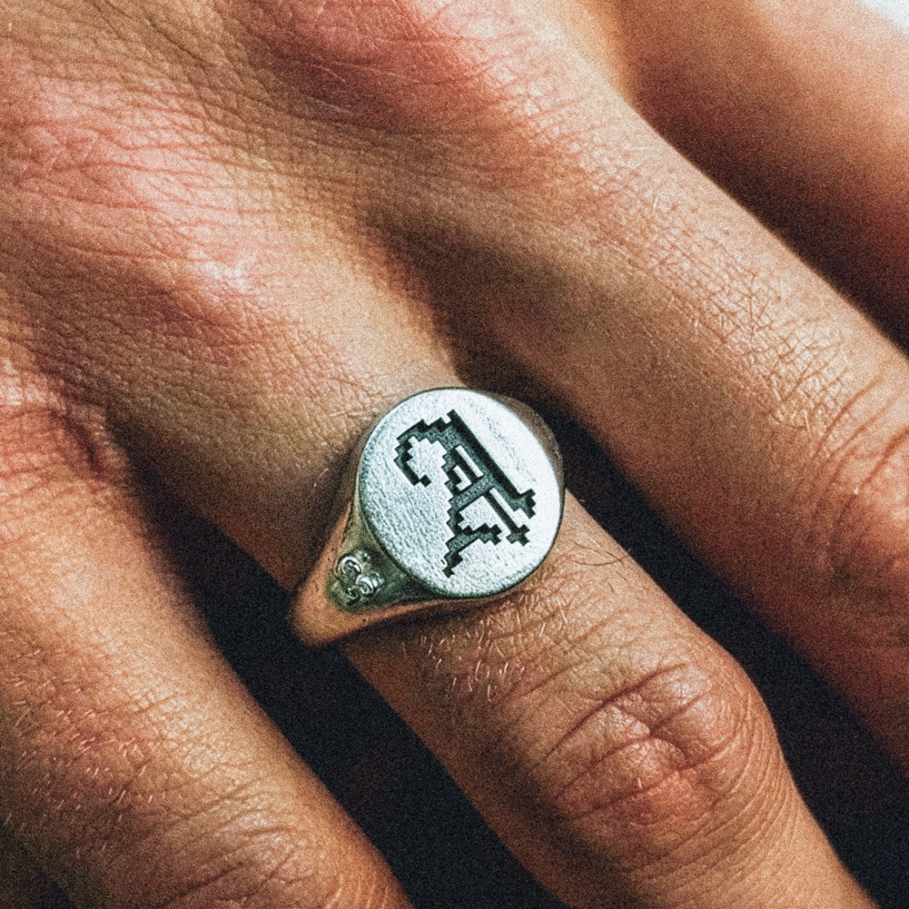
We explored creating a traditional signet ring for members, almost like an old secret society where you have this little symbol that proves you belong.

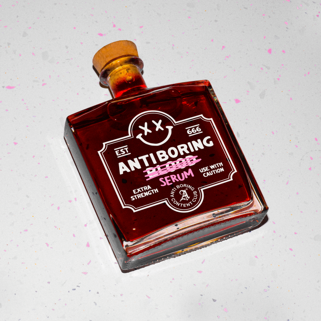
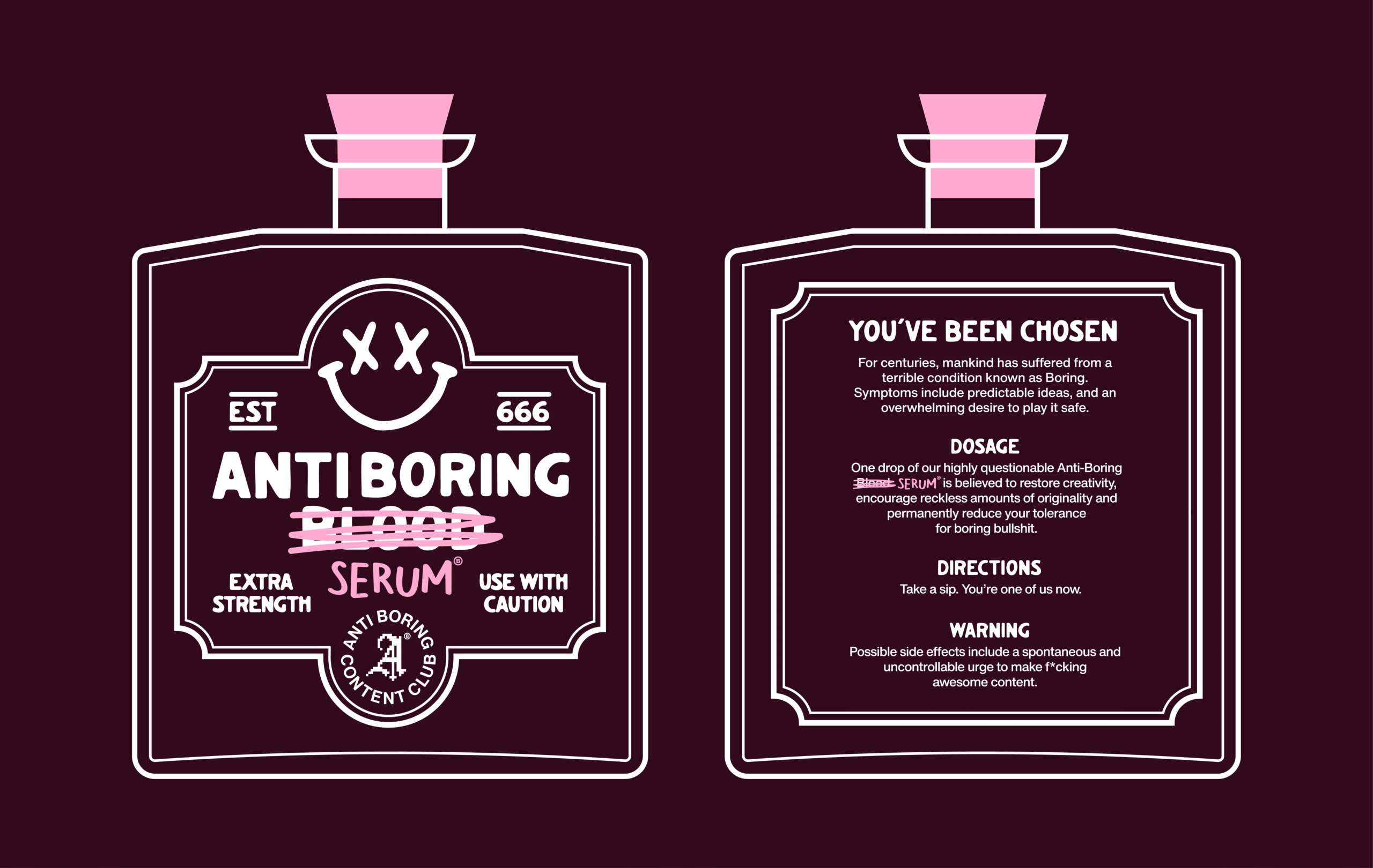
And then there was the Anti-Boring Serum.

The team already had a tradition of sending a small bottle of alcohol to clients when they started working together. So naturally, I thought, why not make it look like they’re sending out little vials of blood?

We created a rather suspicious-looking bottle, with the word blood scribbled out and replaced with Anti-Boring Serum, along with some questionable messaging about what might happen if you drank it.

Completely ridiculous, I know. But that’s what I loved about working with Matthias and the team. They weren’t afraid of ideas that were a bit weird, and they understood that sometimes the most memorable parts of a brand are the little things nobody expects.

We weren’t just creating a new logo for an agency. We were building this strange little world that people could become part of, with its own symbols, traditions and personality. And I think that’s a pretty fitting outcome for a business that never wanted to be ordinary in the first place.
WATCH THE FULL BREAKDOWN CASE STUDY VIDEO

Not much of a reader? No worries. Me and my buddy Jack sit down and talk through the entire project, from the initial ideas and creative thinking to the final identity and everything in between.